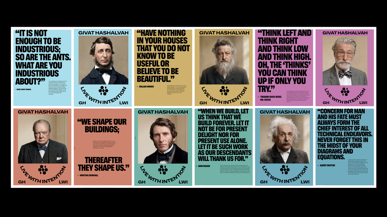
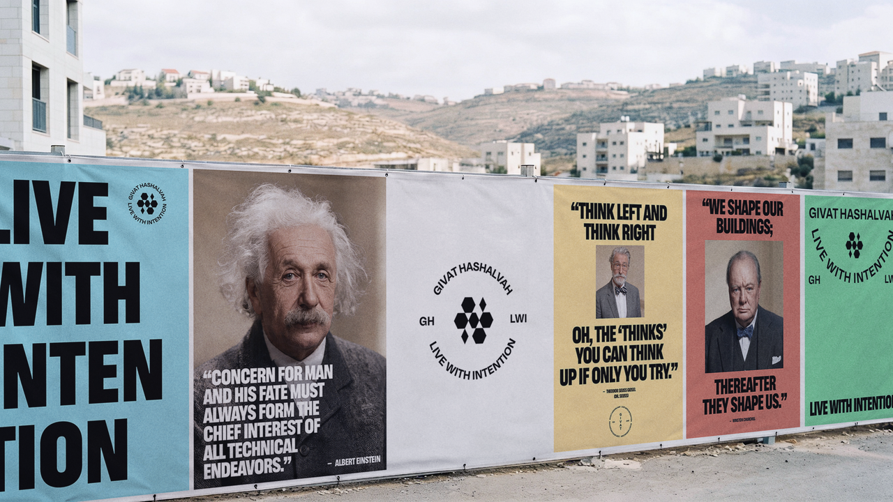
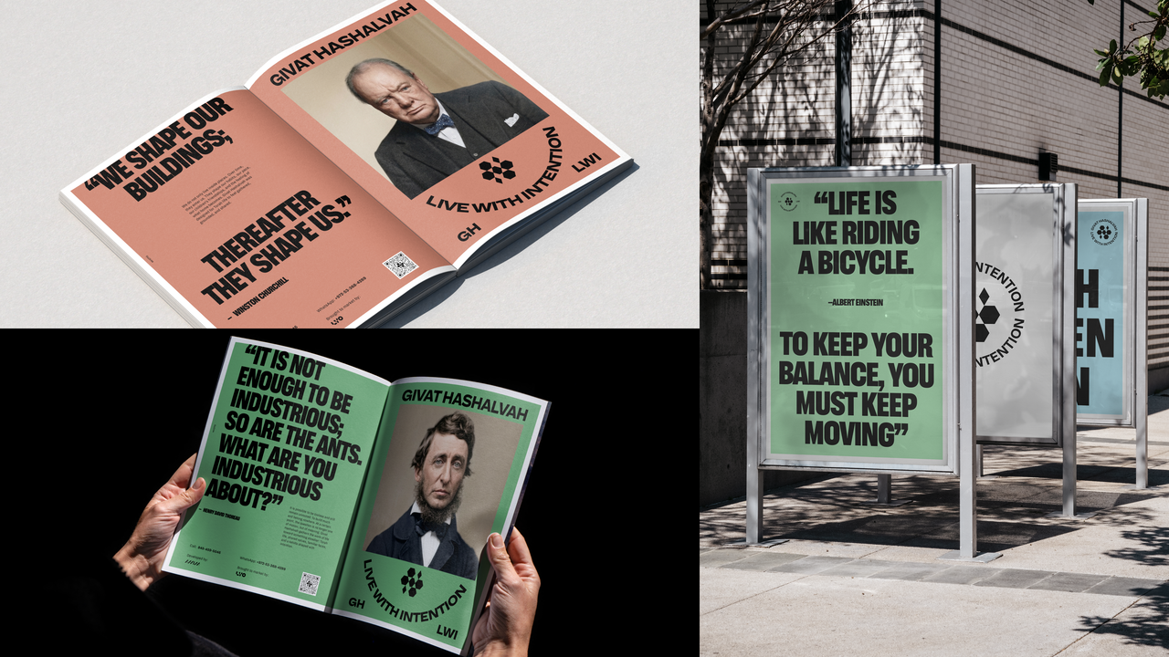
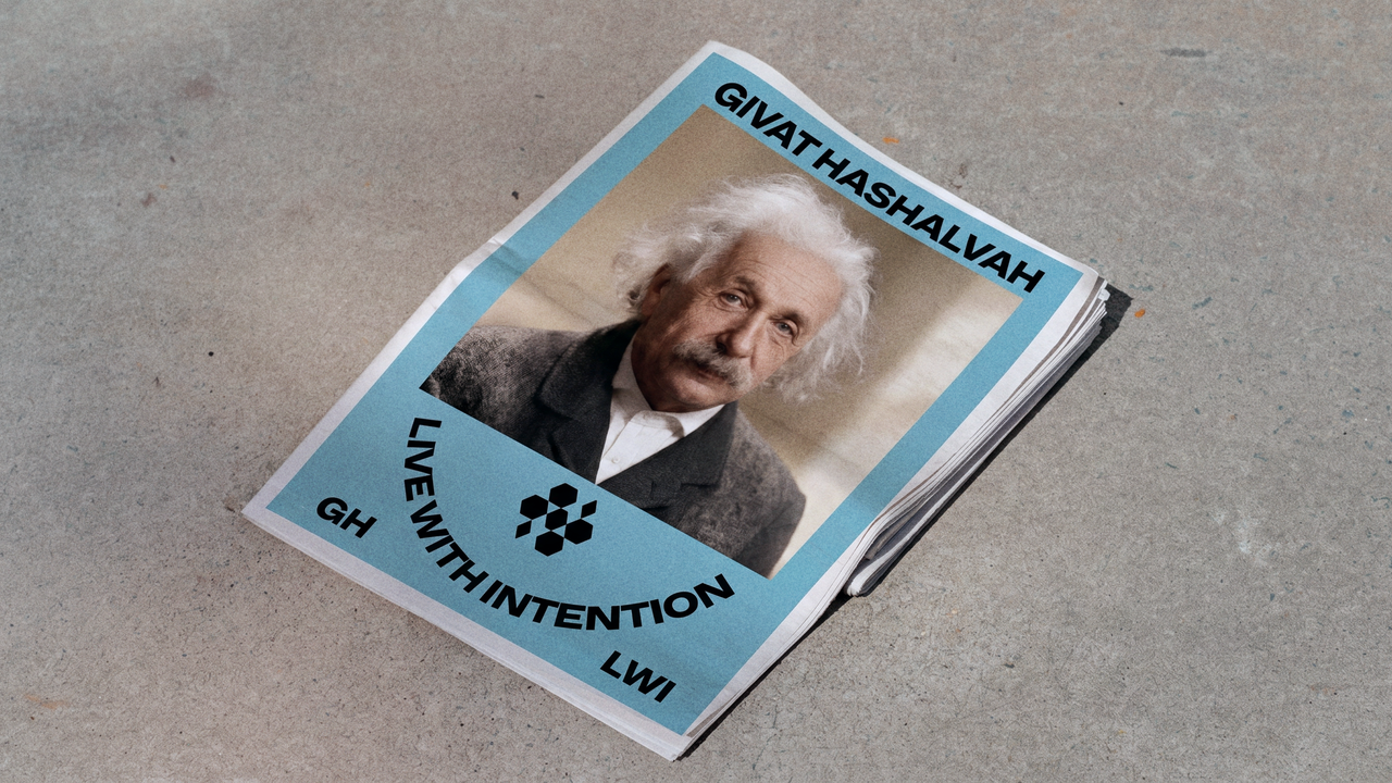
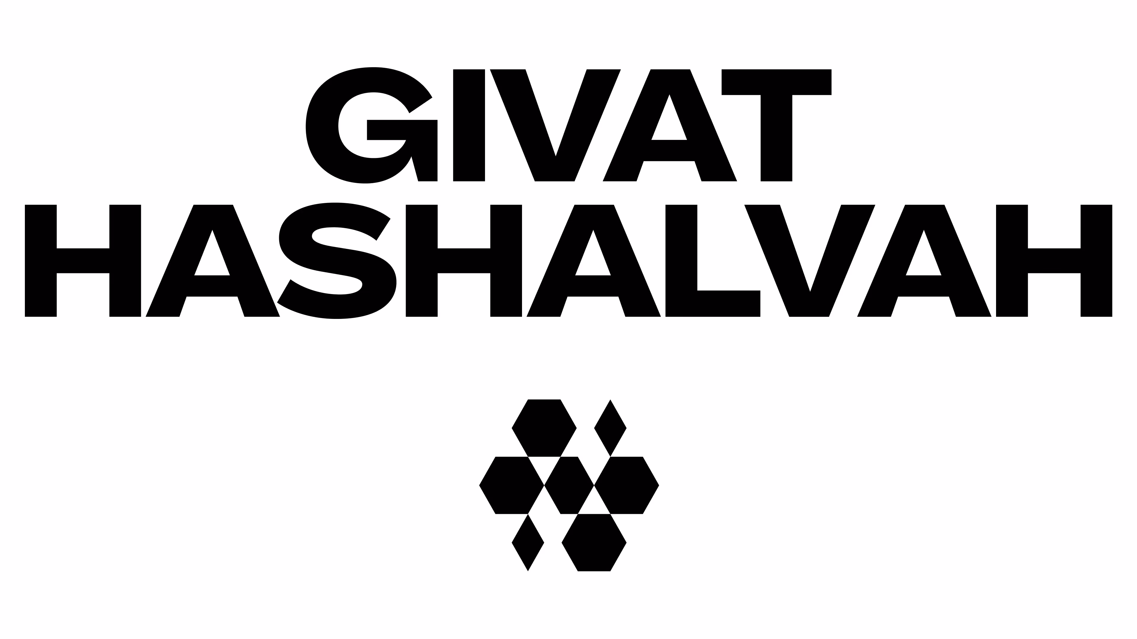
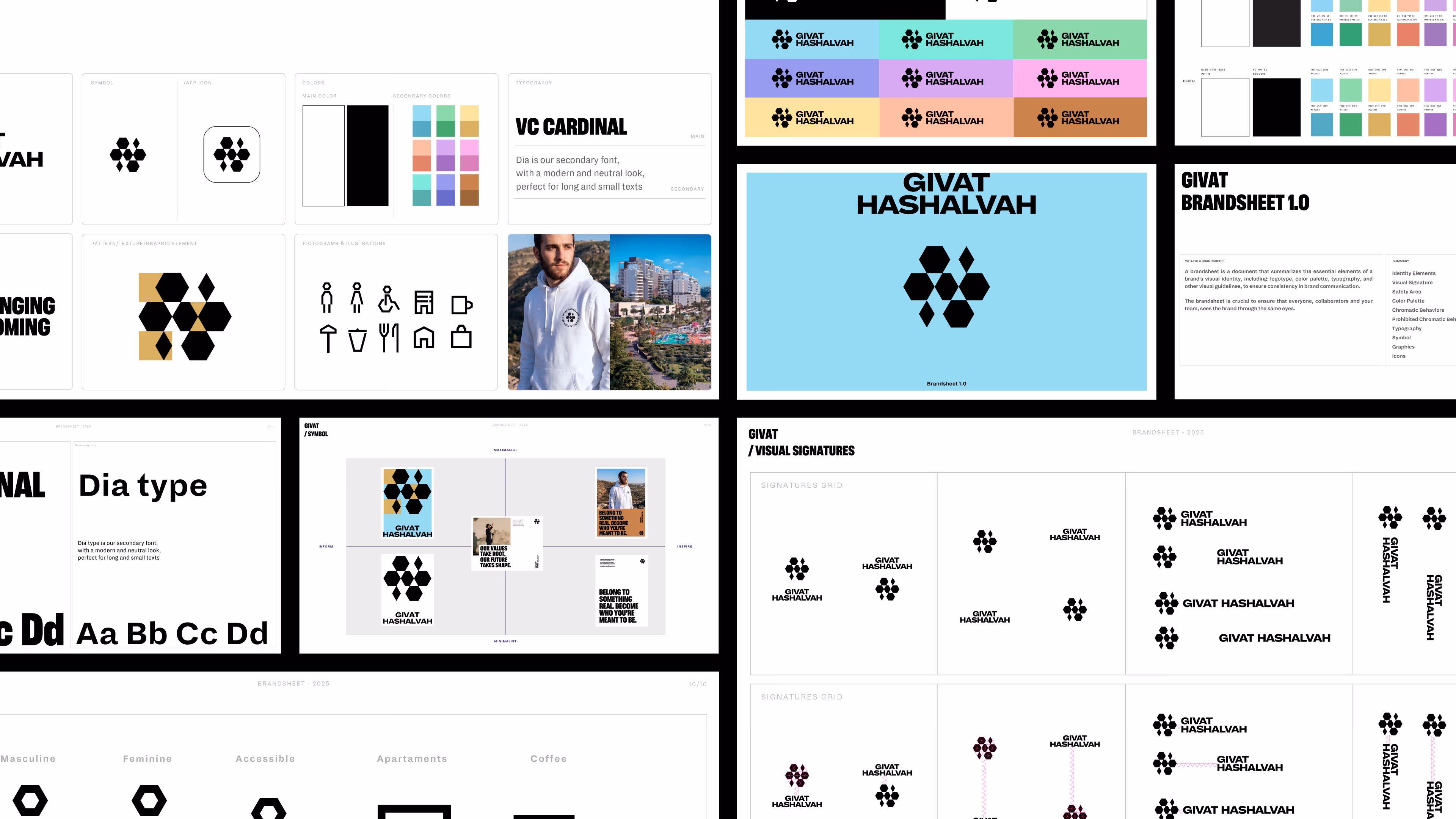
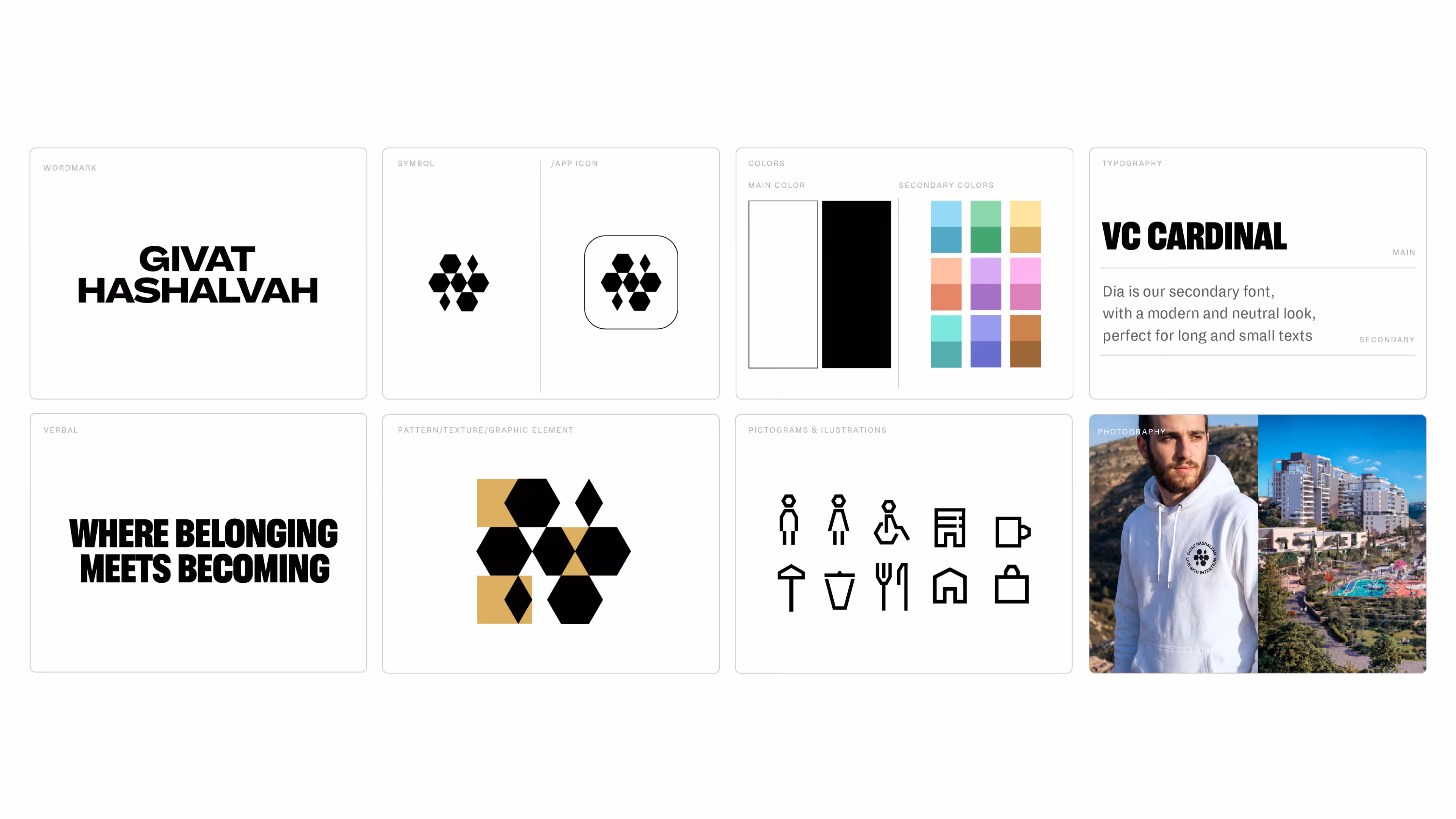
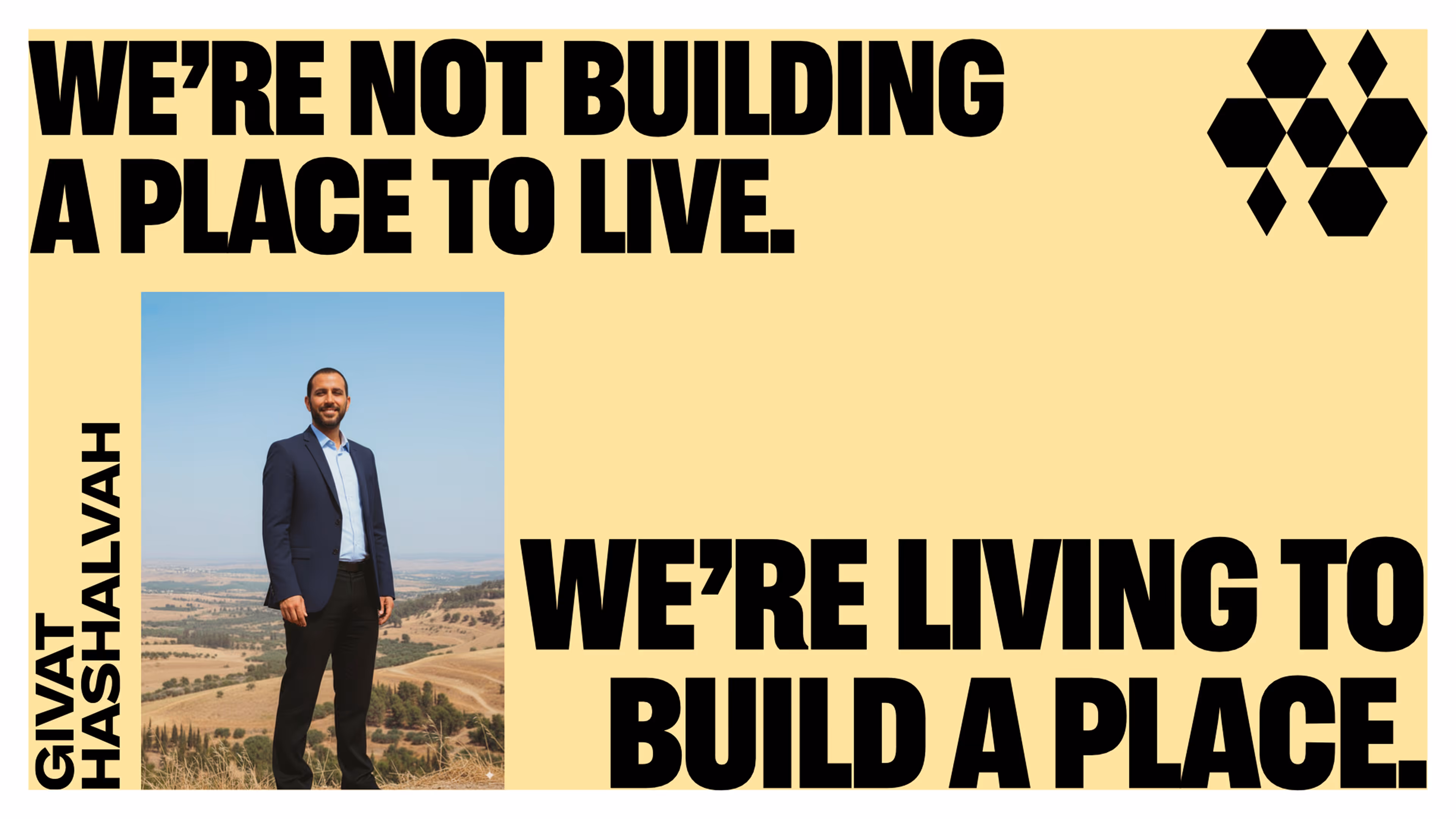
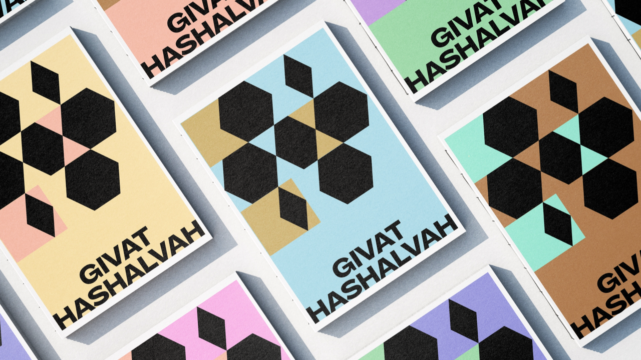
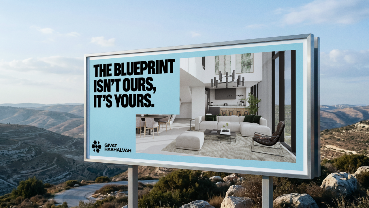
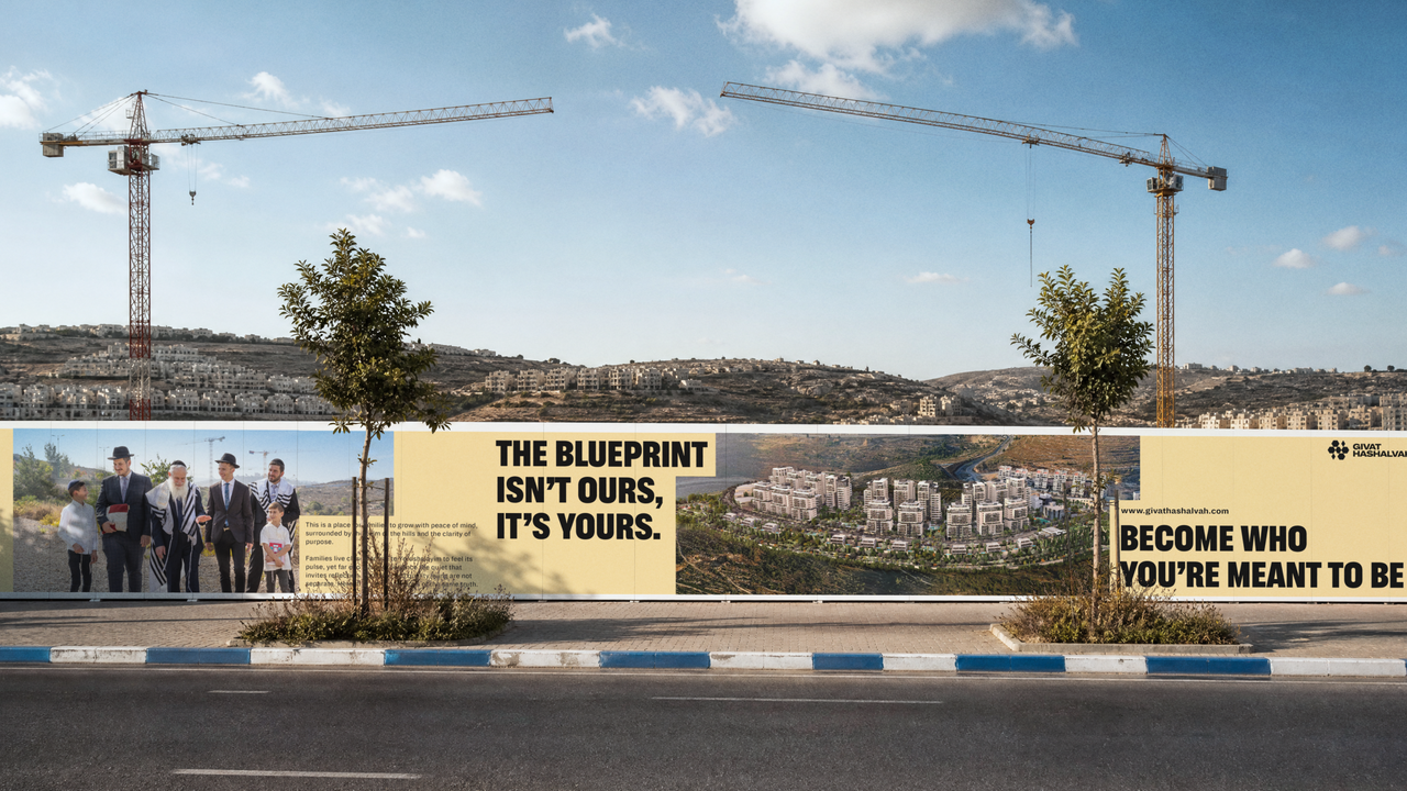
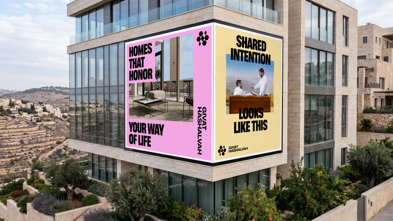
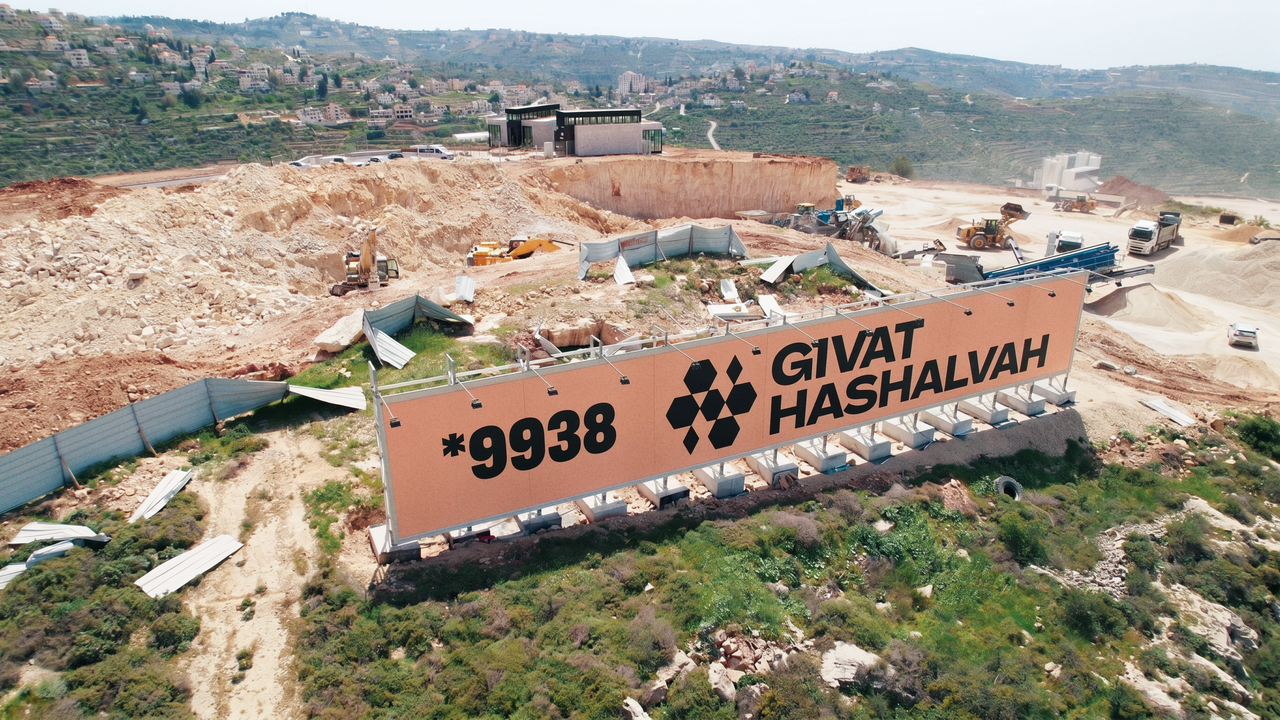
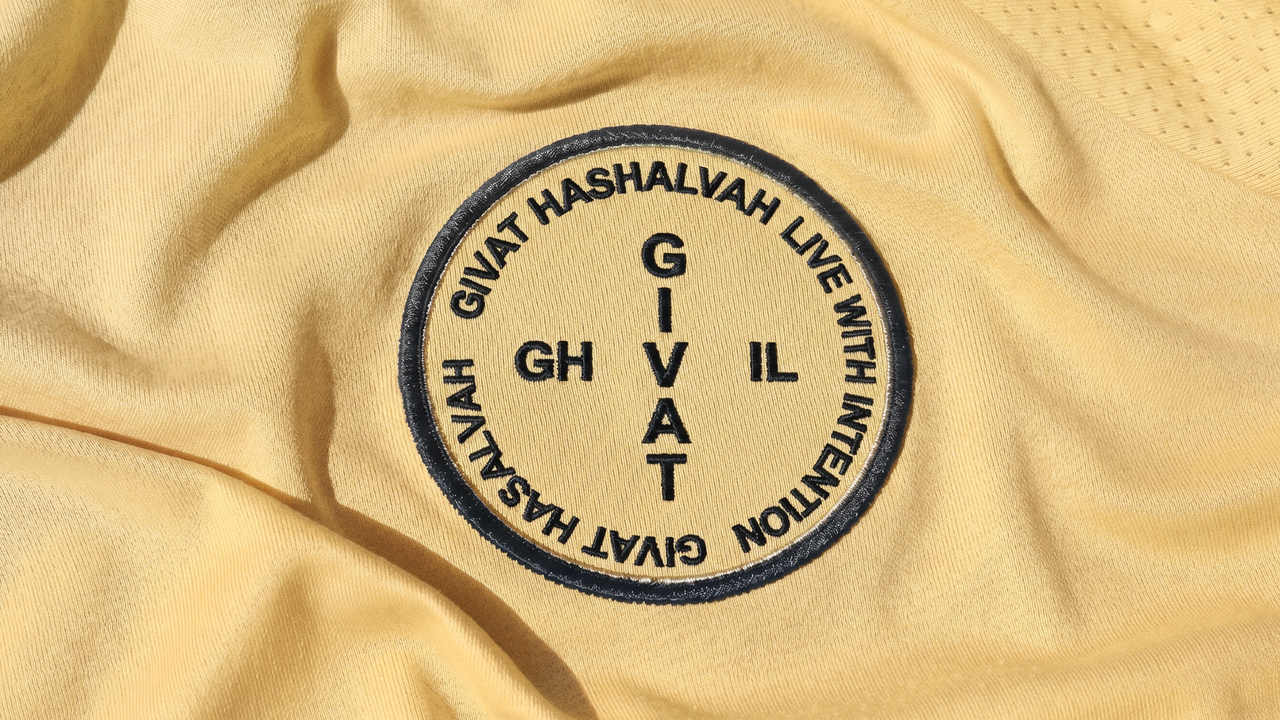
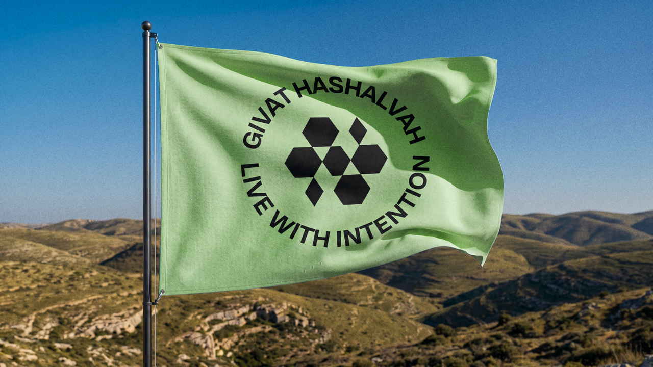
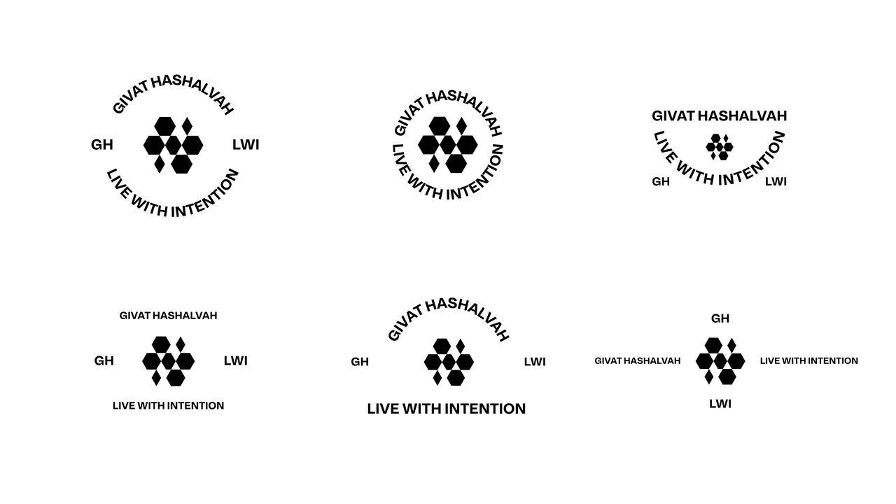
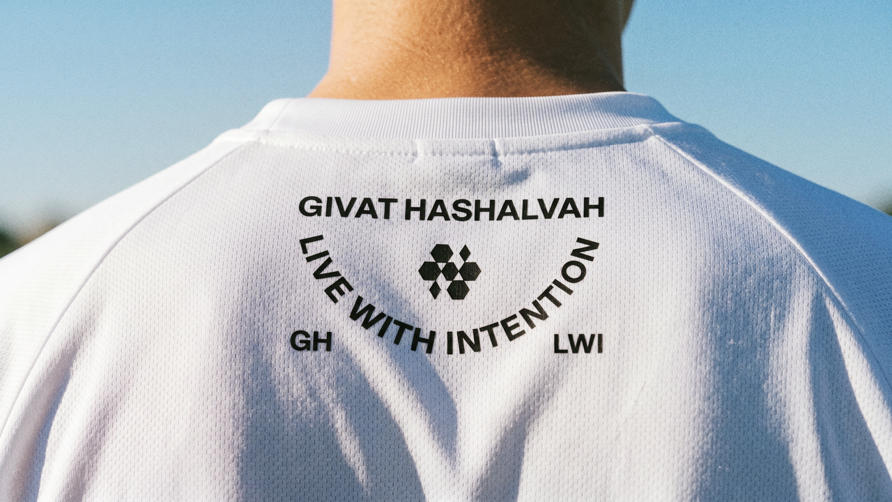
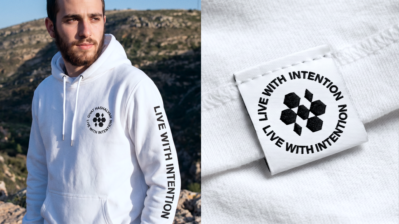
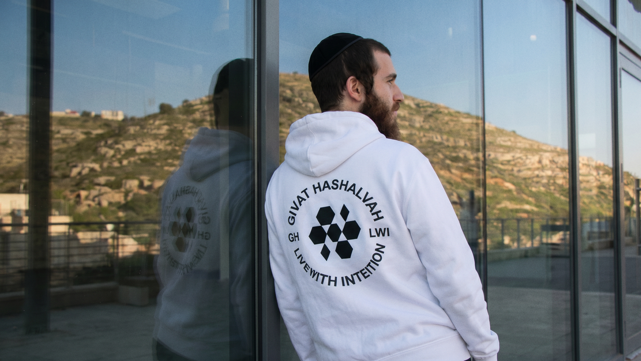
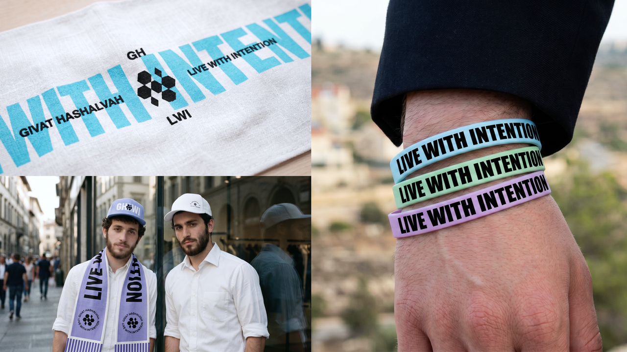
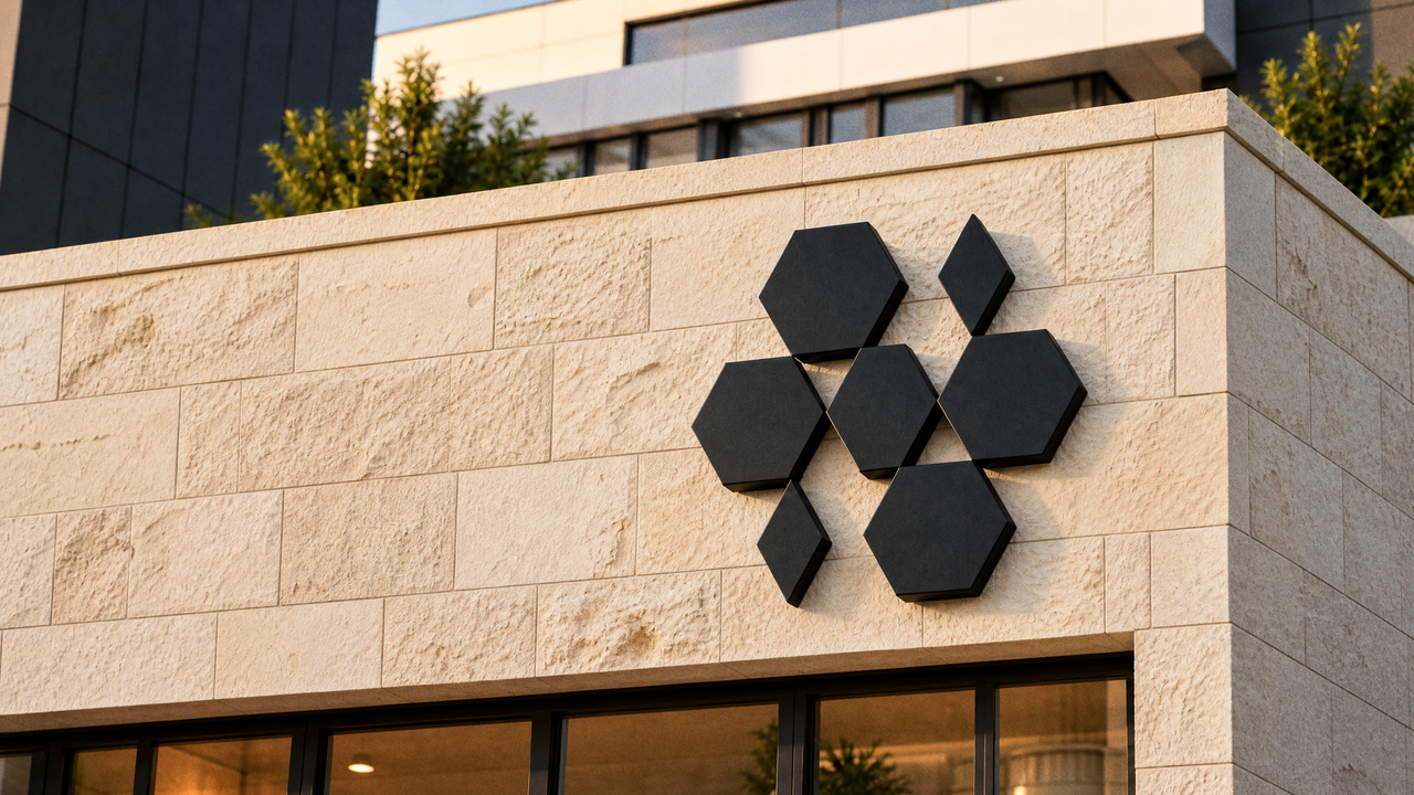
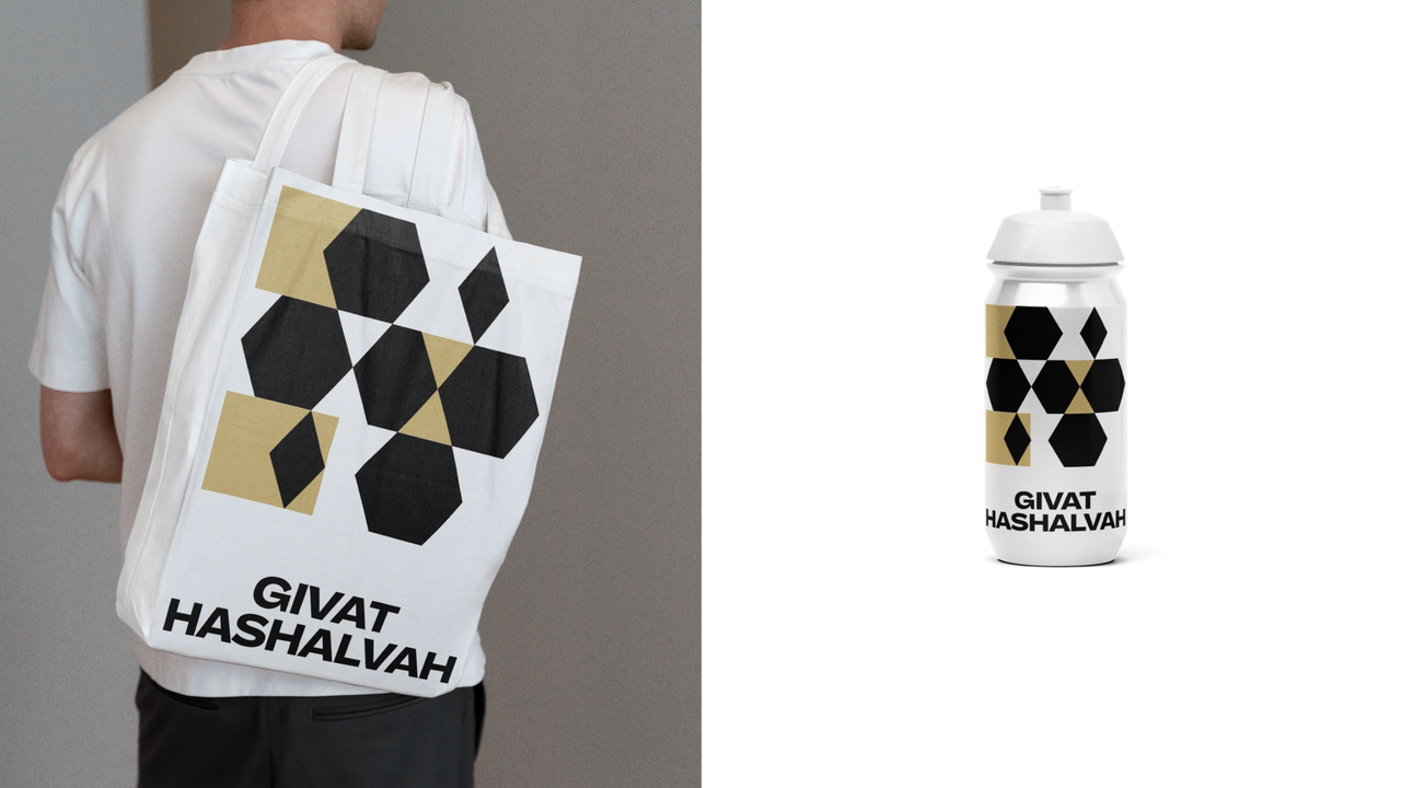
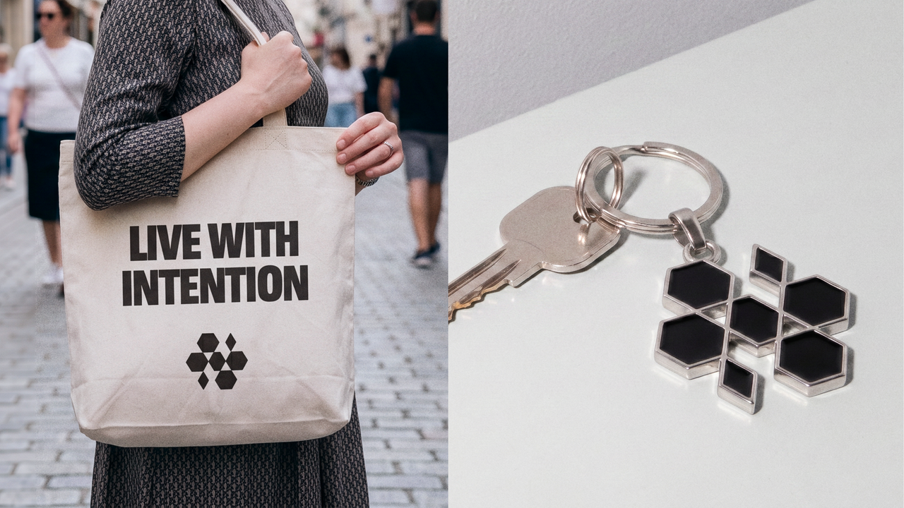
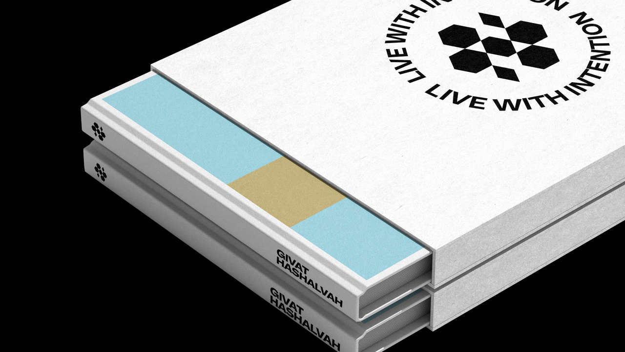
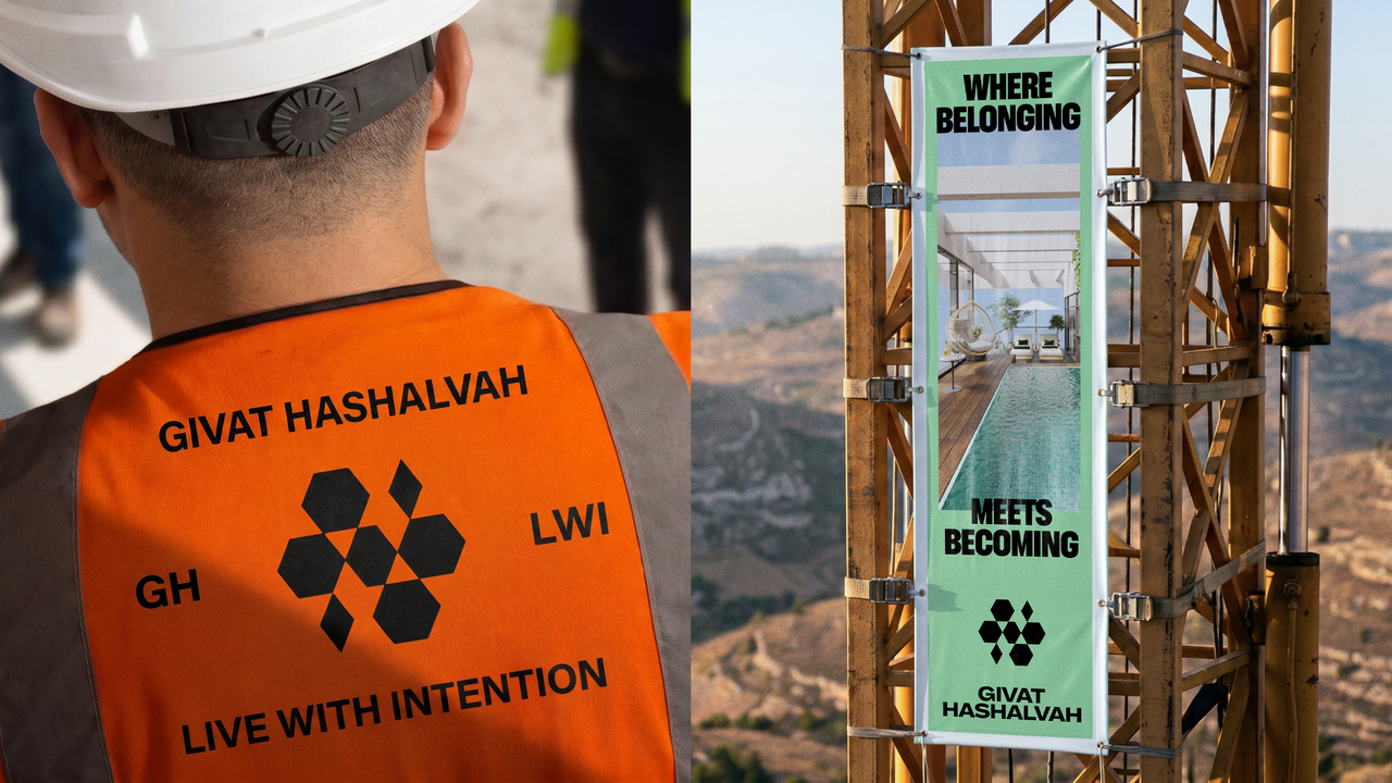
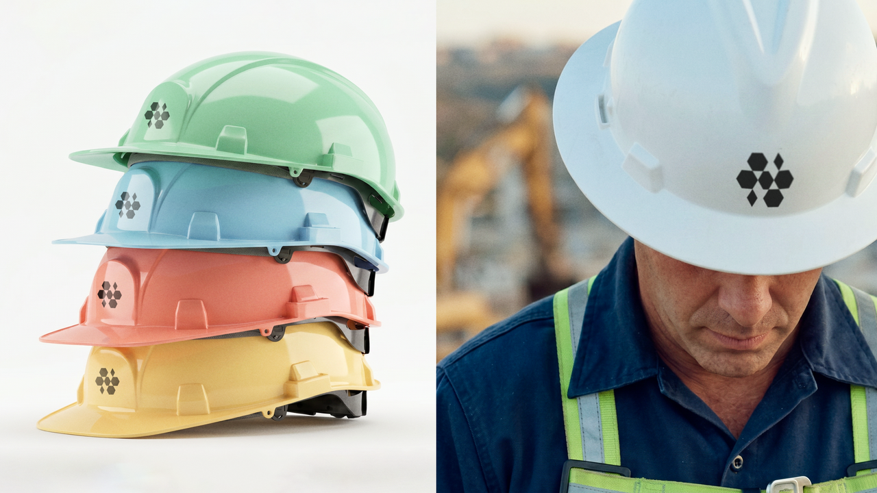
A Symbol for Interconnected Living
The project became a destination of purpose and permanence for families seeking meaning and values in where they live. The symbol became a central piece of the system. We needed a form that could hold belonging, structure, and transcendence at once, and the hexagon became the answer. It expressed organic growth, shared strength, and the beauty of interconnected living. More than a mark, it became a visual engine for the brand, with the agility to extend into architecture, signage, environmental graphics, and community touchpoints. The result felt less like a sales campaign and more like a civic and cultural identity for a place being brought to life.

.avif)
cc.png)
cc.png)
cc.png)
cc.png)
cc.png)
cc.png)
cc.png)

cc.png)

cc.png)
cc.png)

cc.png)
cc.png)
cc.png)
cc.png)