When an existing publisher came to us to launch a new magazine for the Jewish heimishe women’s audience, the opportunity was bigger than creating a publication. The brand needed to feel like a haven: warm, uplifting, human, and deeply centered on women. It had to support growth, celebrate family life, and make readers feel seen and understood.
We positioned the brand around two core ideas: Enable Potential and Kindle Happiness. In other words,help women become more of who they already are and more of who they’re meant to be.


In a crowded category of familiar formats and visual sameness, the real opportunity wasn’t improvement. We did not want to make a slightly better magazine. We wanted to create one with real onlyness. So instead of following the familiar rules of the category, we explored the white space around it and asked what a new kind of women’s title could feel like.
That shift gave the project its direction. The goal became clear: build a brand with enough clarity, confidence, and symbolic power to feel instantly distinct and genuinely meaningful to its audience.


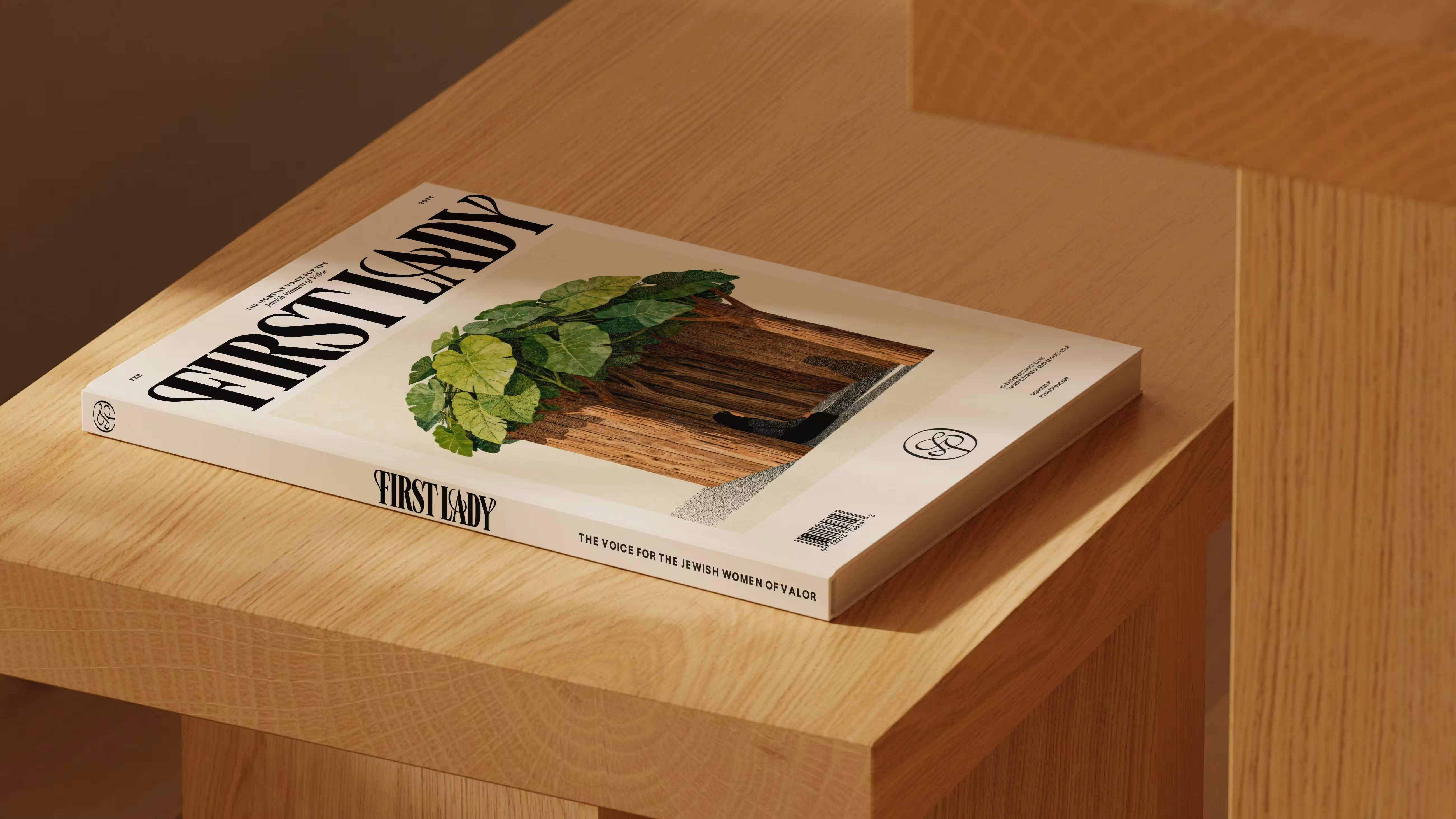
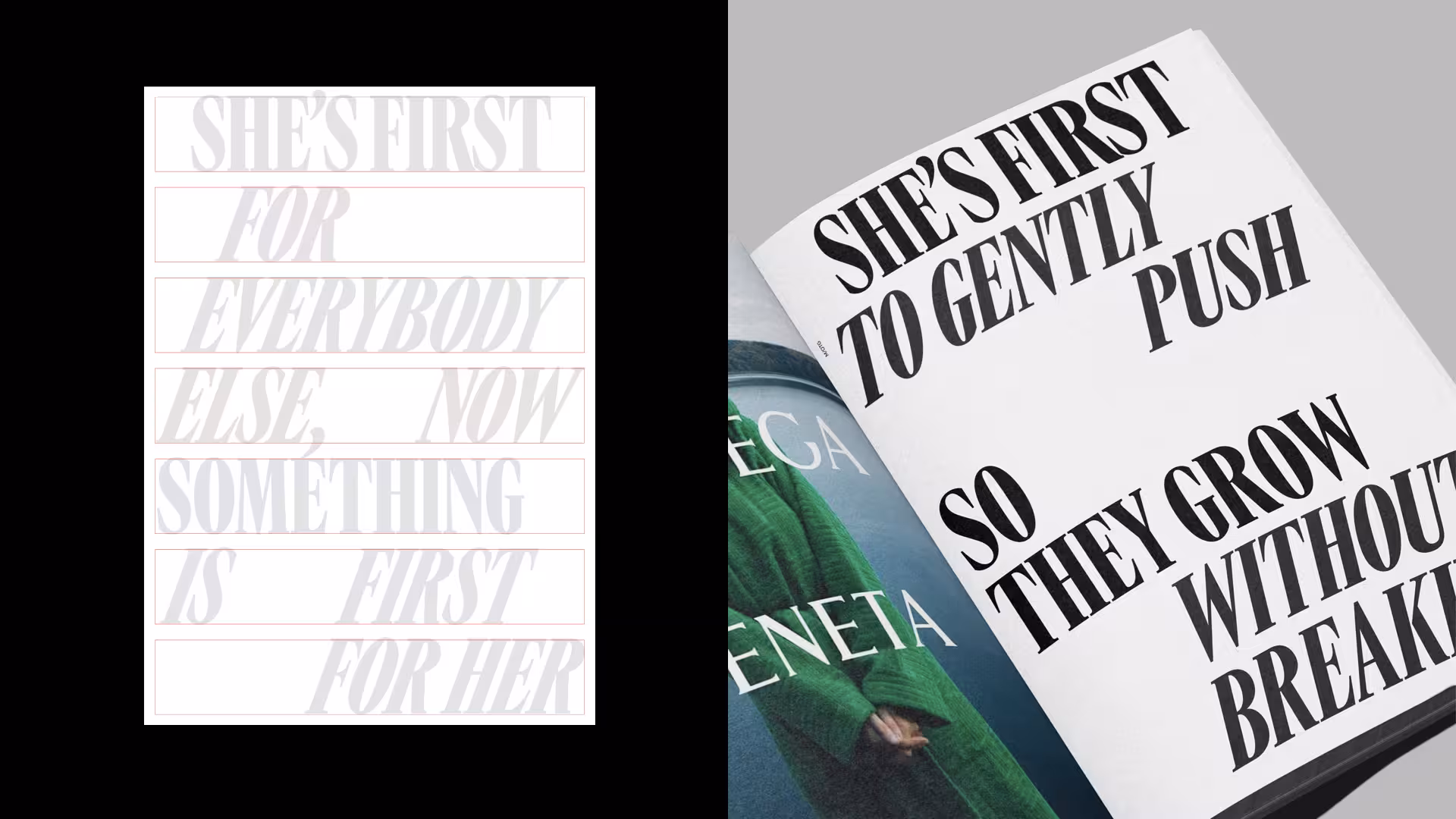
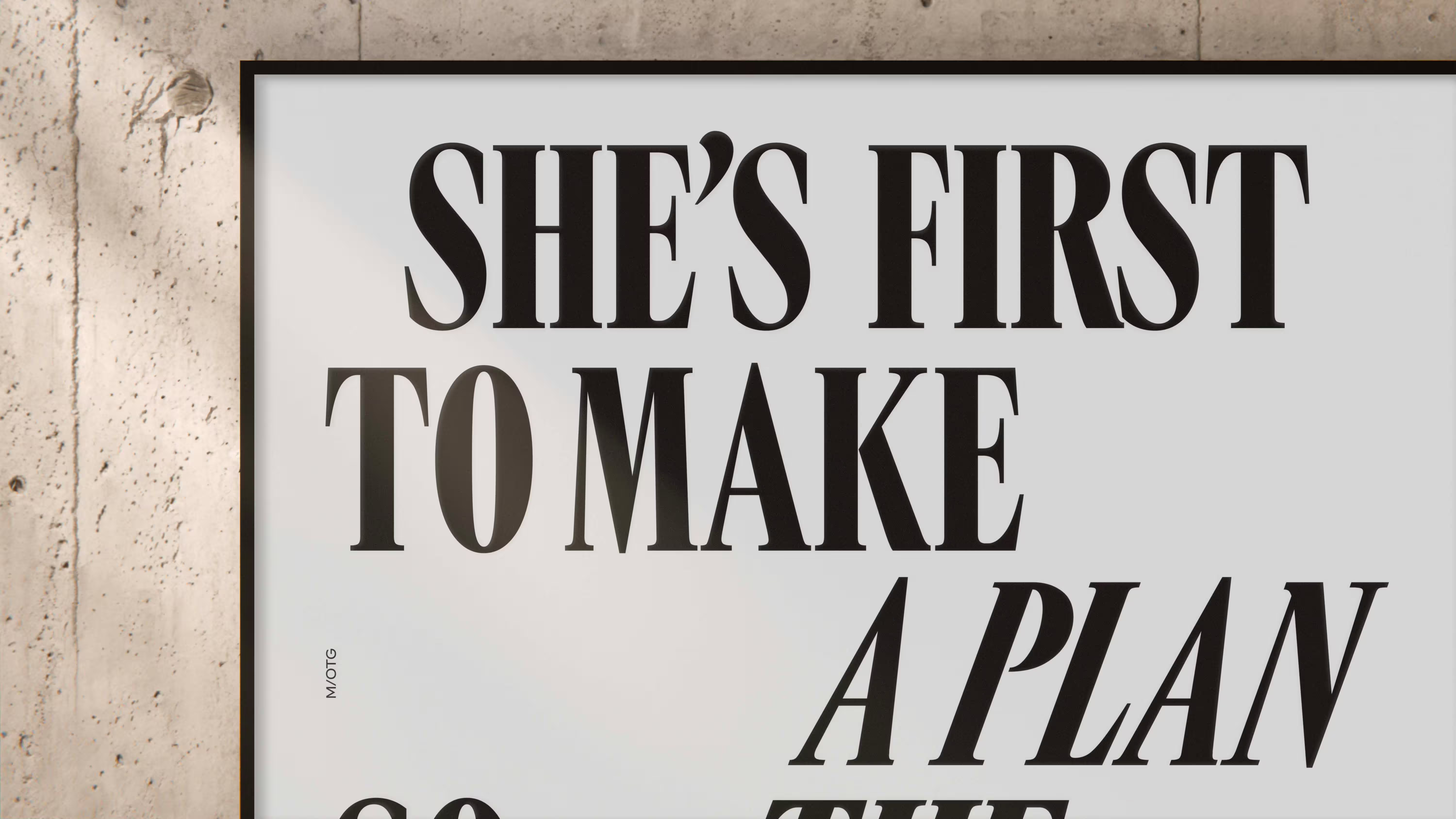
The breakthrough was the name: FIRST LADY. It changed the project instantly. The name gave the brand stature, clarity, and a powerful customer promise. It said what the audience feels in her life, and what she longs to feel more often: first. It also shaped the brand’s verbal identity, including one of its defining ideas: She’s FIRST for everyone else. Now something is FIRST for her.
Once that idea landed, everything aligned. The name elevated the entire brand, clarified its position, and helped transform the publication from a standard launch into a more prestige-minded property with a stronger point of view.


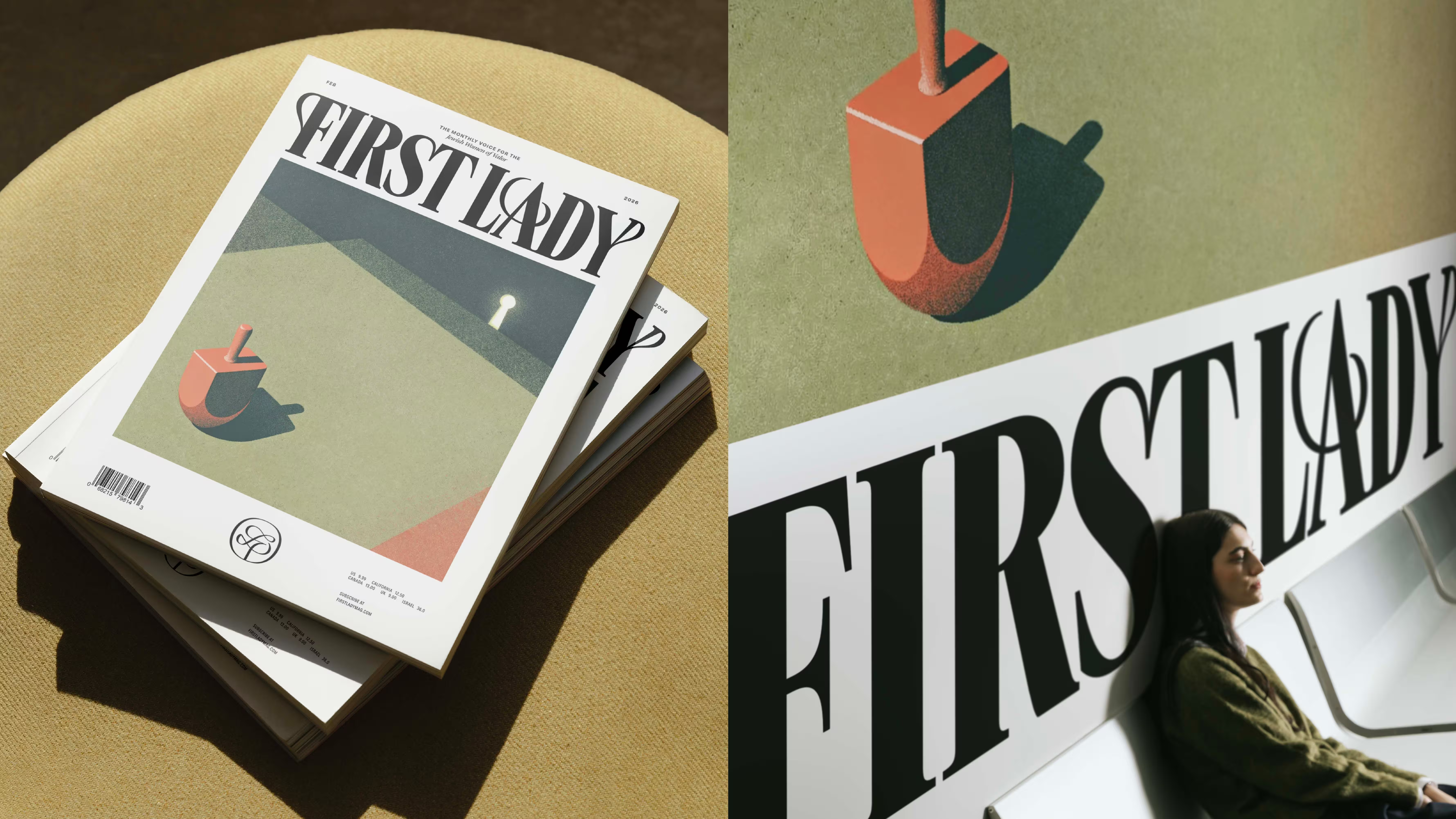
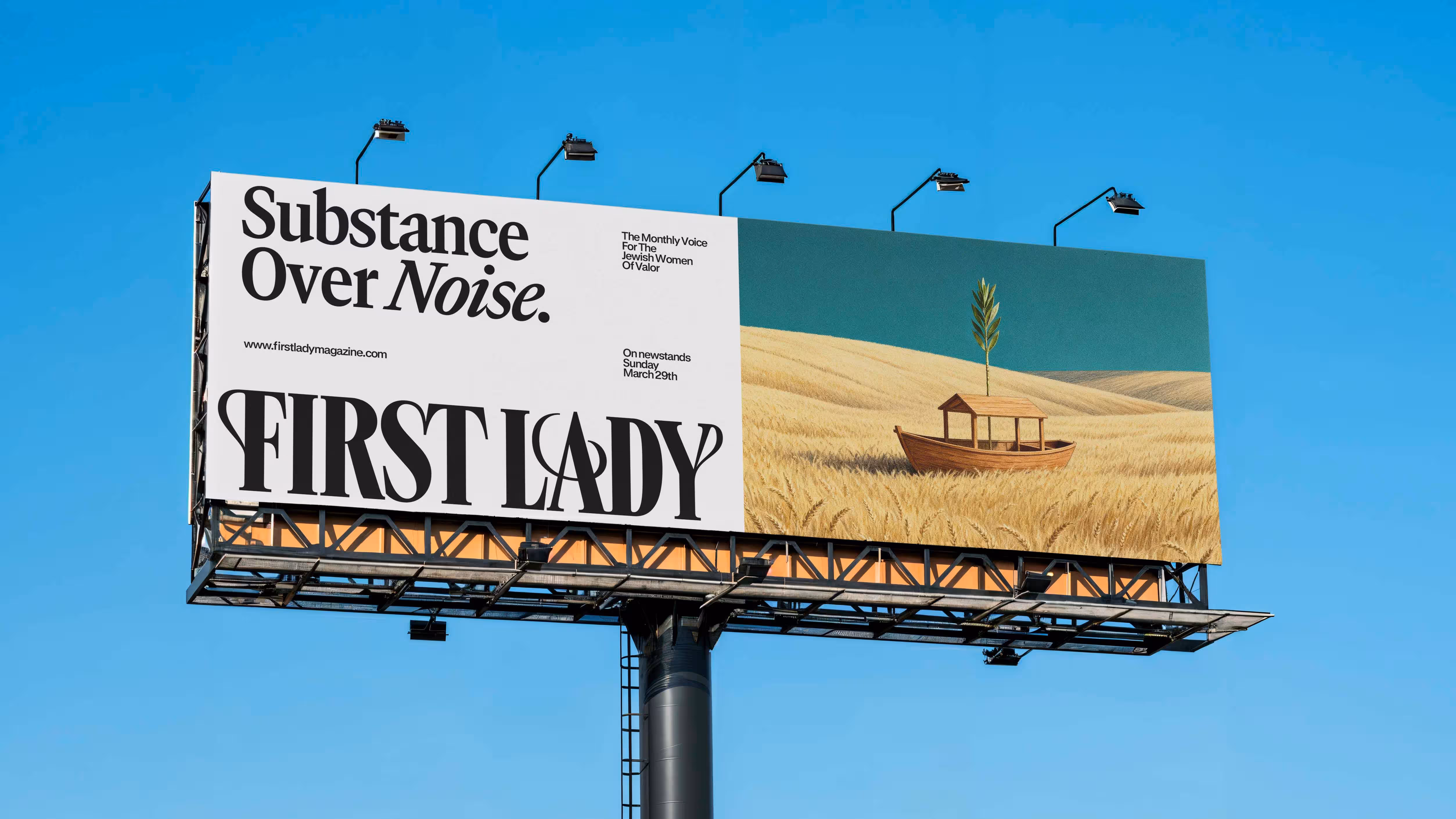
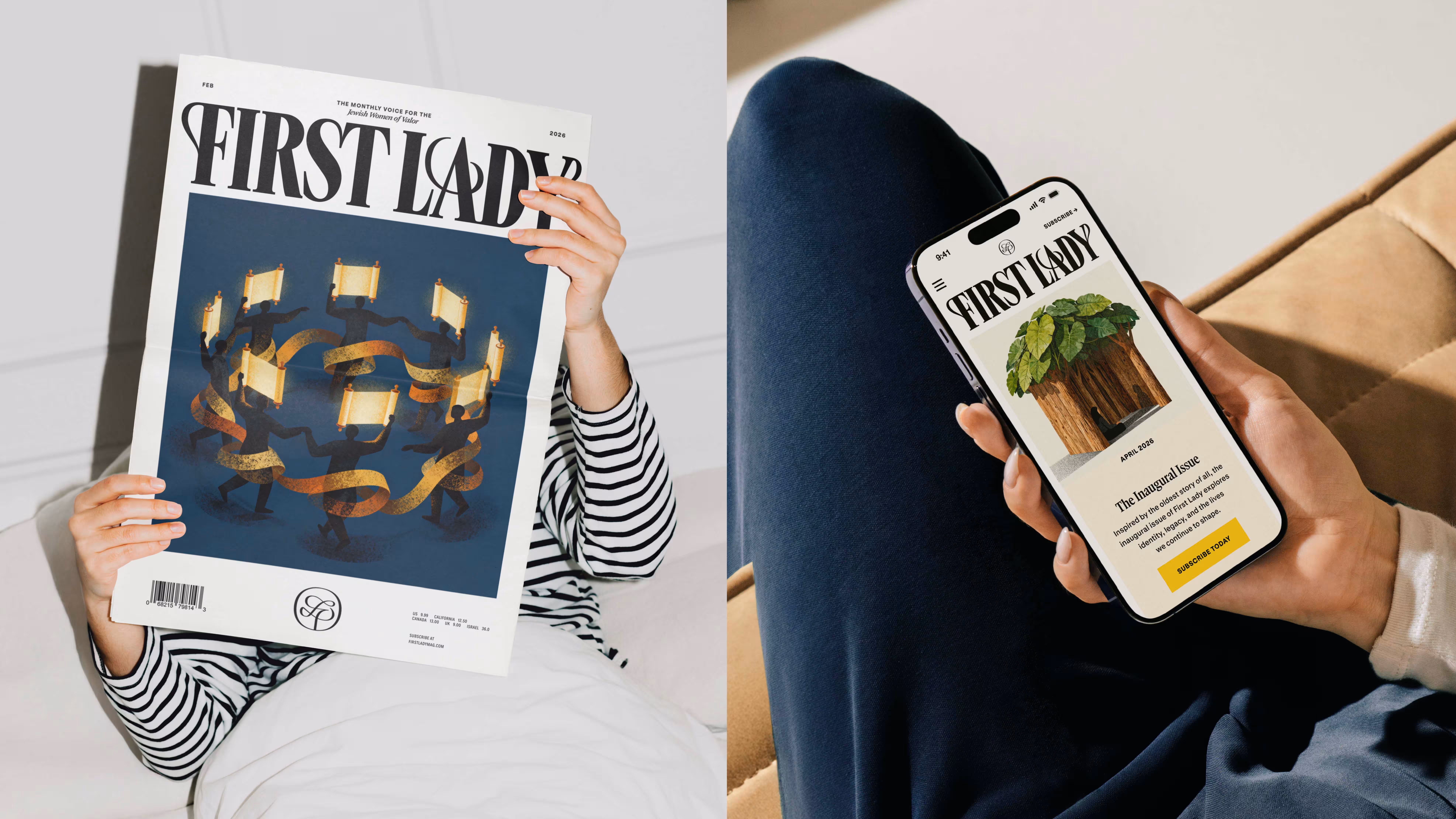


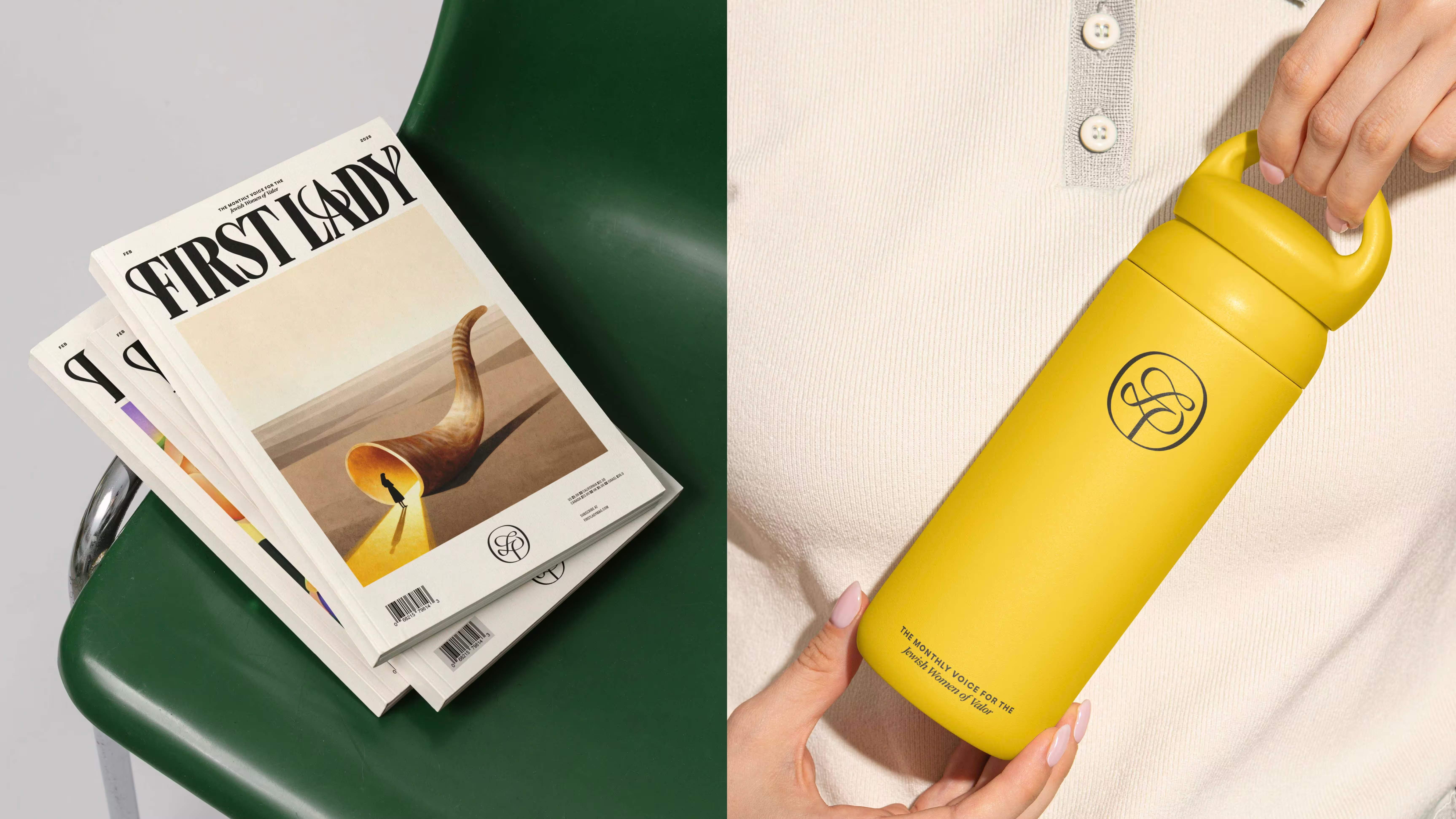
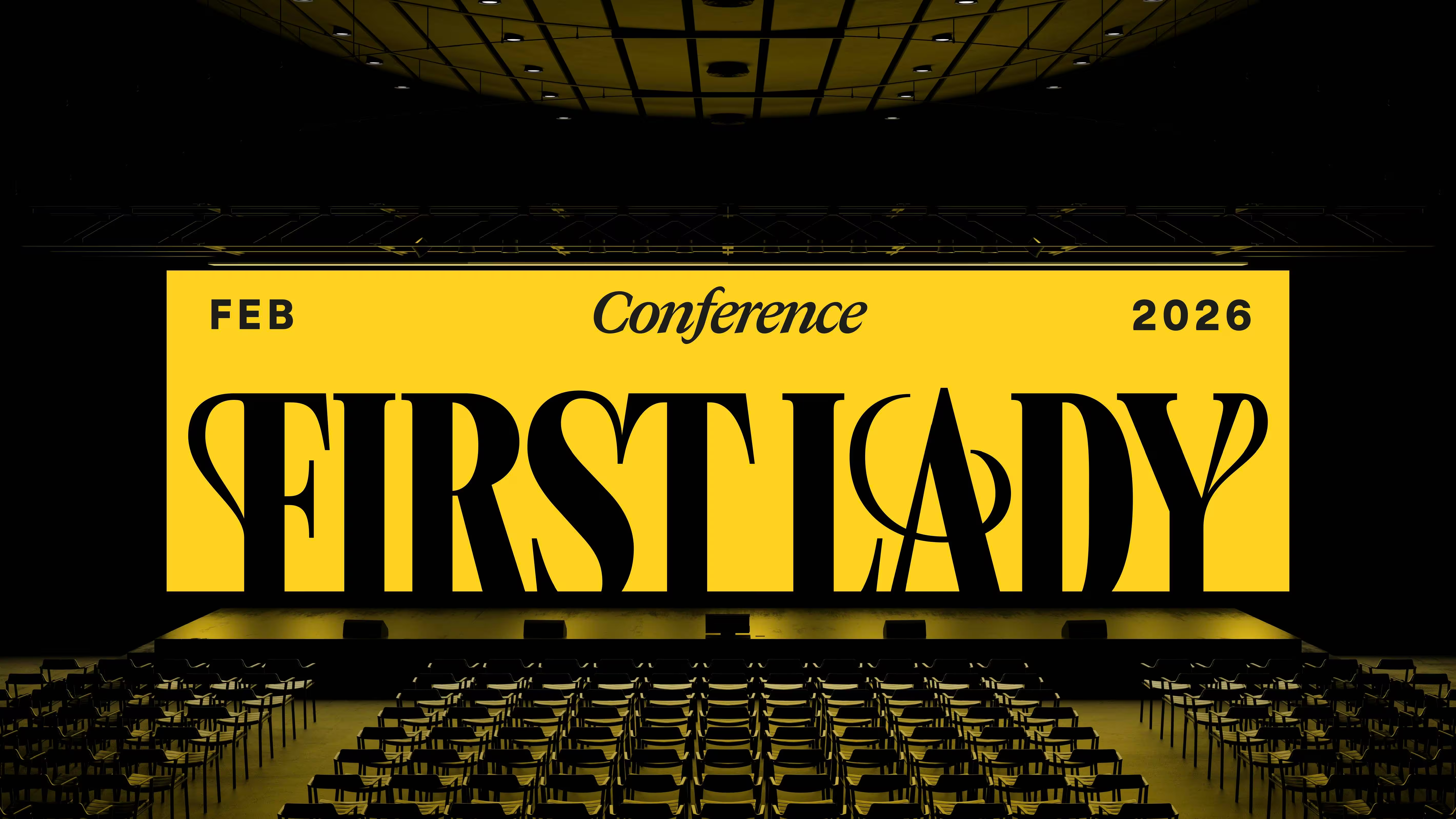
We created the name, strategy, verbal identity, visual identity, cover system, editorial direction, and subscriber platform. The final brand paired FIRST LADY with the category line “The Monthly Voice for the Jewish Women of Valor”, lifting the publication above the level of “magazine” and giving it cultural depth and symbolic weight.
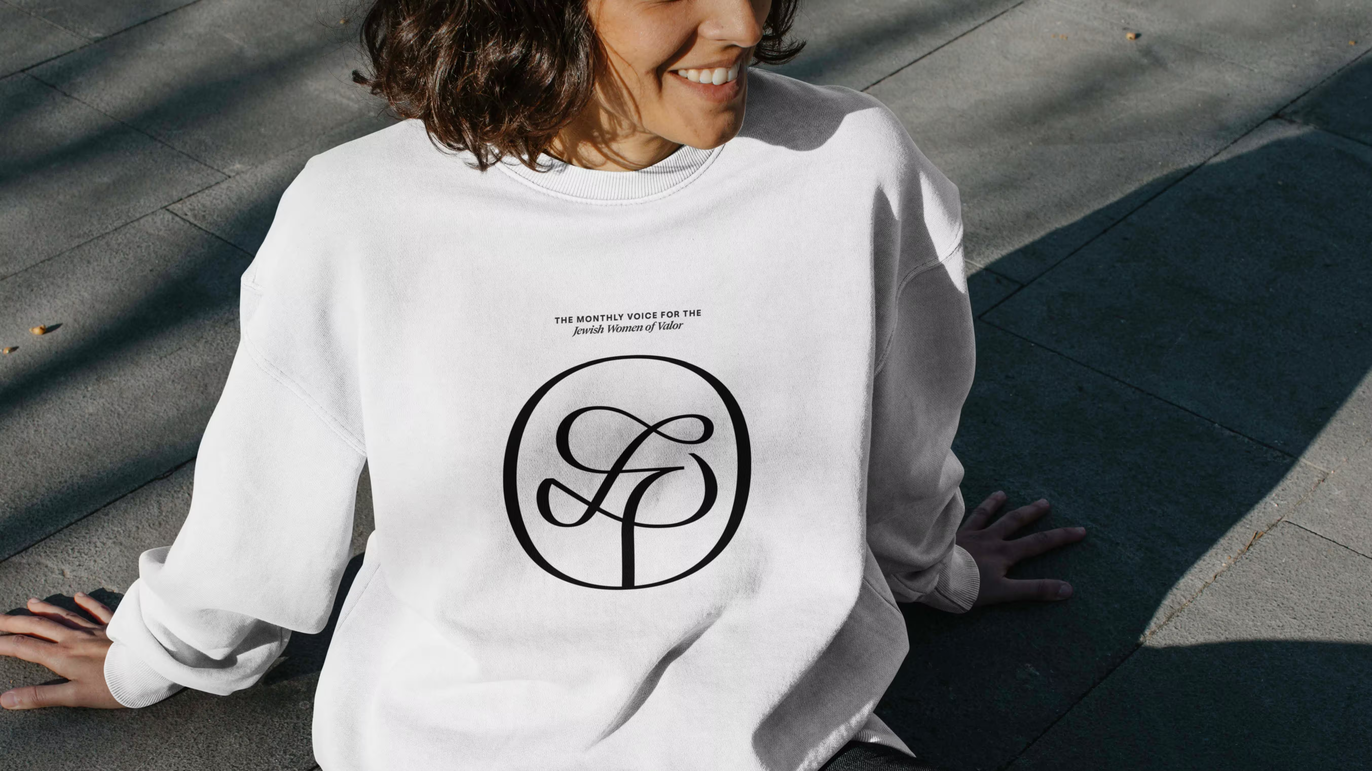
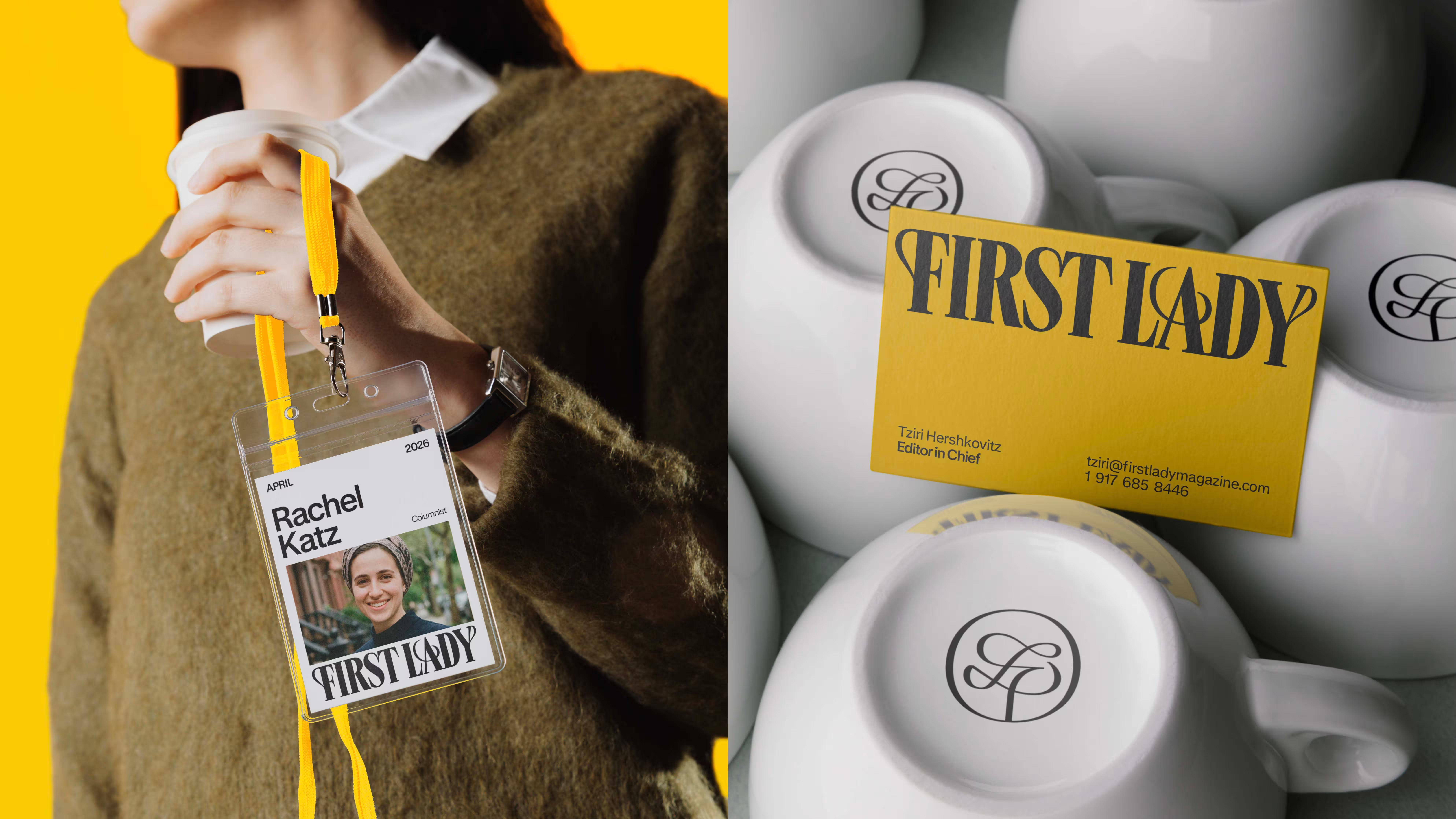
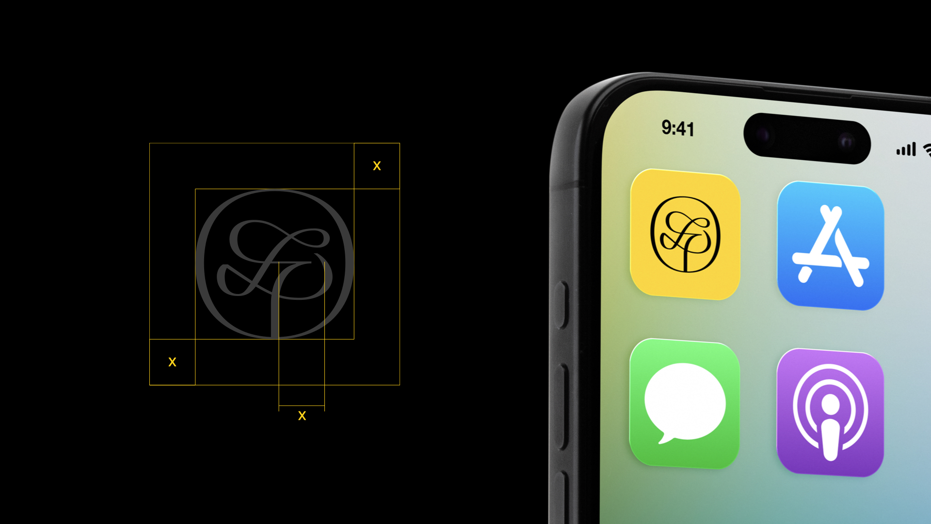
Visually, we designed the brand to zag against the category. While others competed with clutter, FIRST LADY used restraint as a strategy. We created a custom monogram inspired by the Tree of Life, merging F and L into a memorable symbol, a bespoke wordmark with confidence, and shelf presence, an all-white cover system with a full-width black masthead, illustration-led covers instead of photography, and no teaser headlines, no promo clutter. Inside, the editorial system blended the best of magazine, newspaper, and book. A deep yellow signature color added warmth and distinction across print and digital touchpoints.

FIRST LADY launched with a presence that felt unmistakable. It redrew the category. It became the first title in its space to claim an all-white cover, a full-width black masthead, sophisticated illustration-led covers, no teaser headlines, and a true brand symbol. Those weren’t cosmetic moves. They were strategic moves. They made the brand instantly legible as a new idea.
More importantly, the brand fulfilled its deeper purpose. It created a monthly voice that made frum Jewish women feel valued, represented, and placed first. In doing so, FIRST LADY introduced a new standard for what this category could become.