Melody sits at the crossroads of caregiving and innovation, a benefit platform built for those who give care, and those who make it possible. The brand serves two audiences whose worlds are deeply intertwined: caregivers who carry the weight of daily life for others, and agencies tasked with navigating a maze of regulations, wage-parity mandates, and retention challenges.
Melody’s outward voice and visual identity were speaking a different language, one of bureaucracy, not belief. The brand looked and sounded technical, transactional, and corporate. It was built to inform, not to feel.
For a platform grounded in care, that distance was too great. Melody needed to look, sound, and behave with the same empathy it was designed to deliver.
Agencies needed clarity and confidence. Caregivers needed belonging and pride. Melody’s brand had to bridge those needs with one clear message: care deserves care.
As societal pressures on healthcare grew heavier, and the caregiving workforce faced burnout and high turnover, the moment for a reset was undeniable. The brand needed not just a new look, but a new philosophy, one that restored dignity to the caregivers at its center and confidence to the agencies that rely on it.


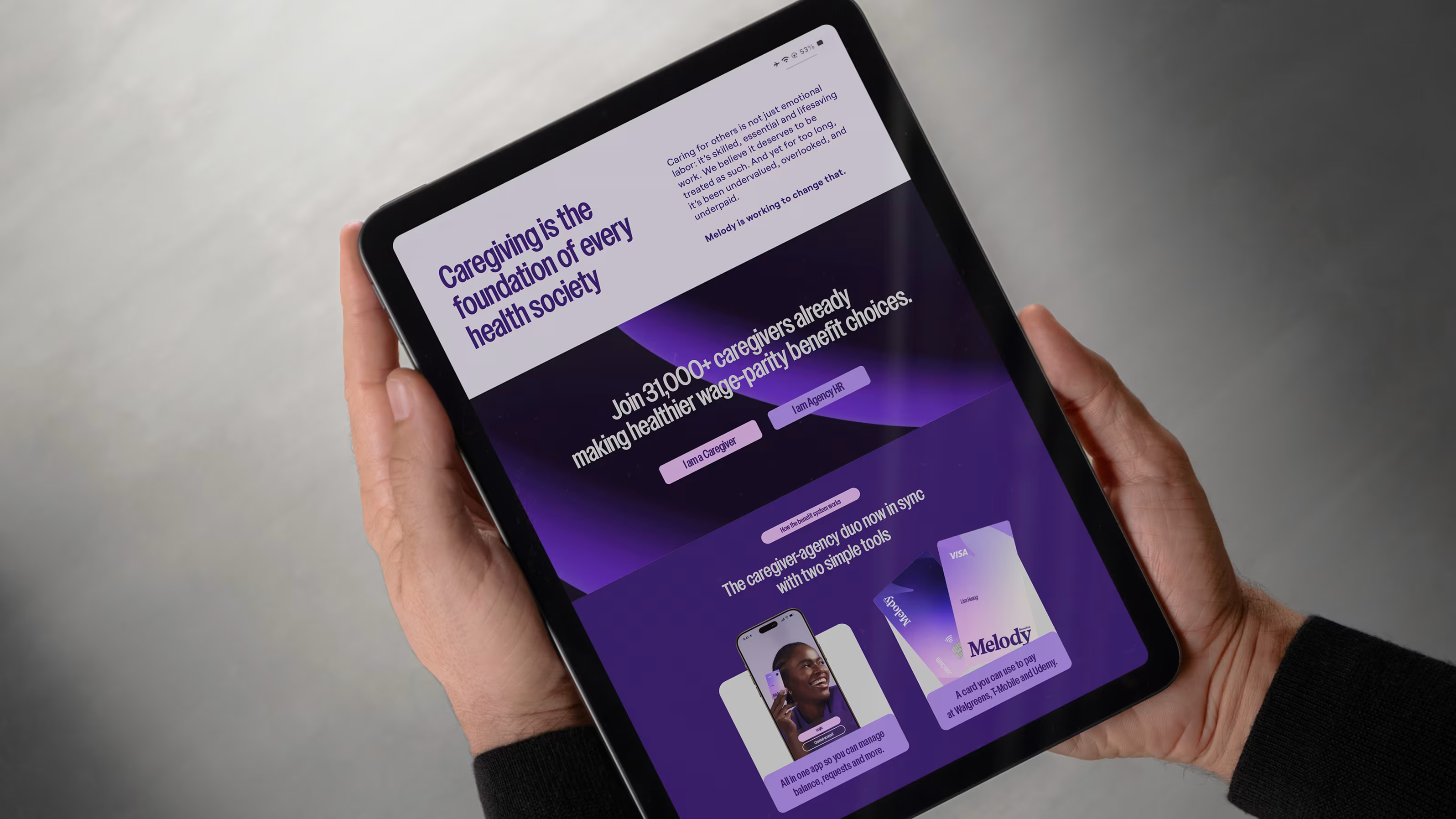
We began by listening to people. Through in-depth interviews with caregivers, agency staff, and industry leaders, we uncovered a simple truth: caregivers don’t need more information. They need the right information, presented clearly and humanely.
From there, we reimagined Melody from the inside out. We replaced a tone of compliance with a tone of compassion. The narrative now begins where it should, with the caregiver, not the system.
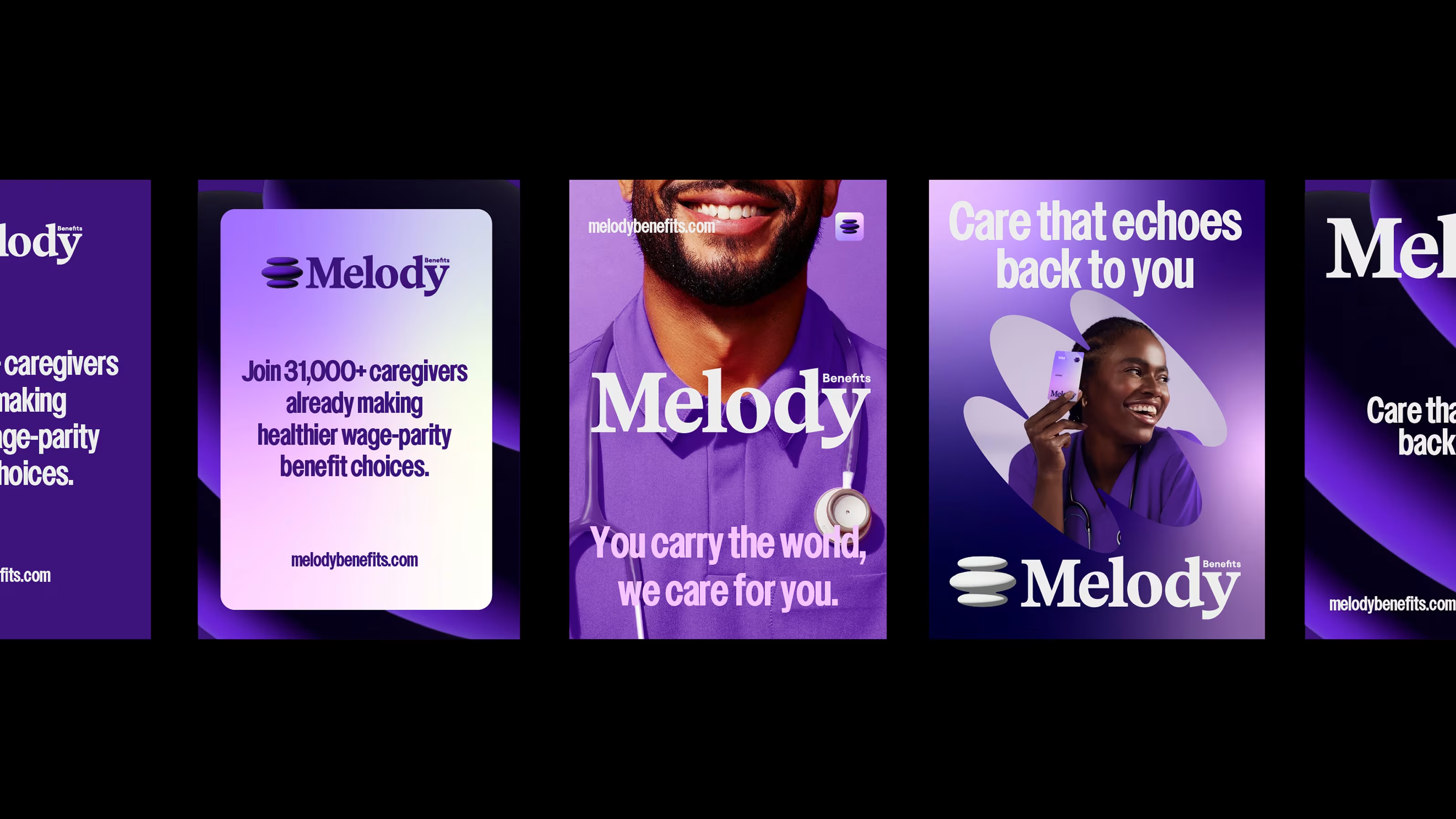
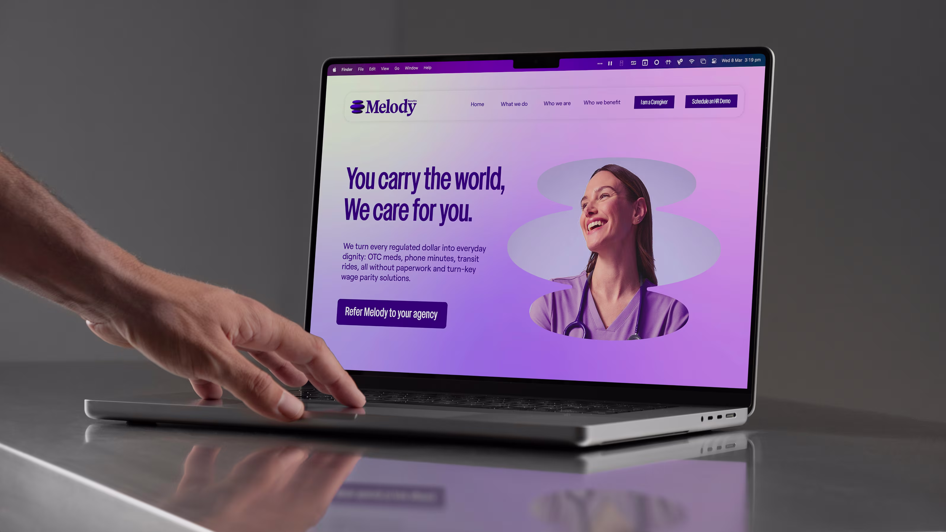
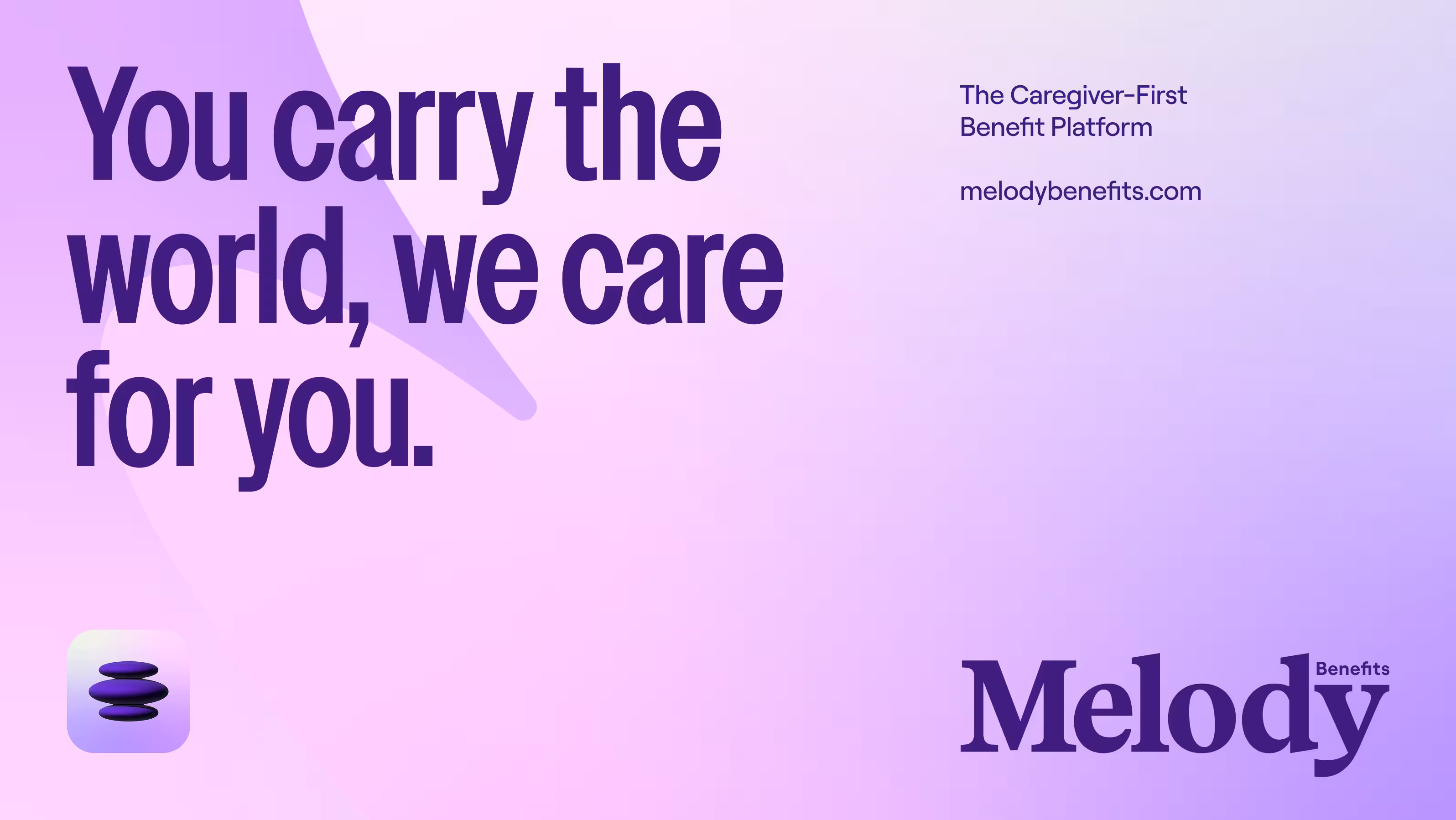
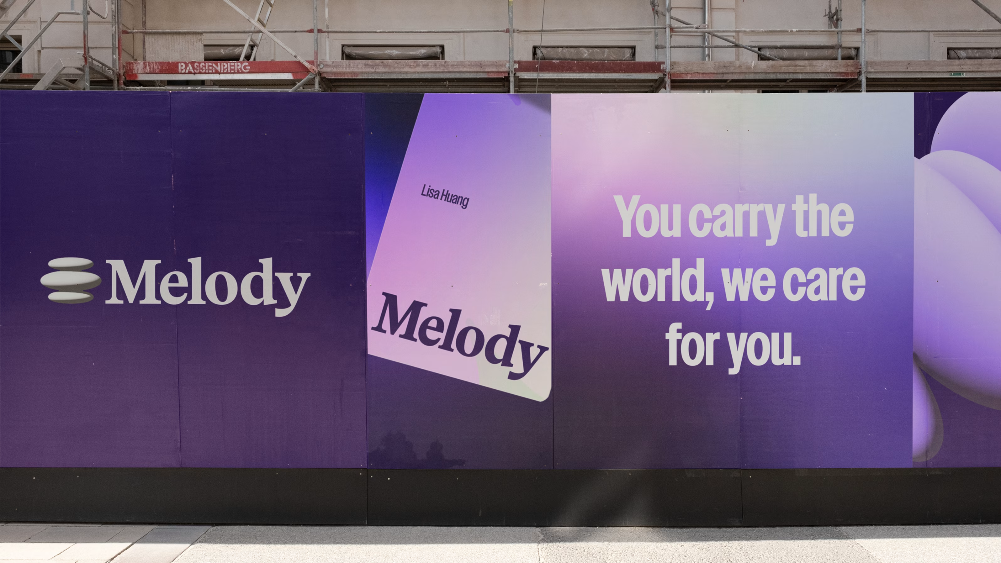
We rewrote every line of communication around a single emotional truth: “You carry the world, we care for you.”
We sought to build a visual system that would feel at once credible to agencies and warm to caregivers, where trust meets tenderness.
What emerged was a full-scale transformation, a rebrand that speaks not only to the head but to the heart.
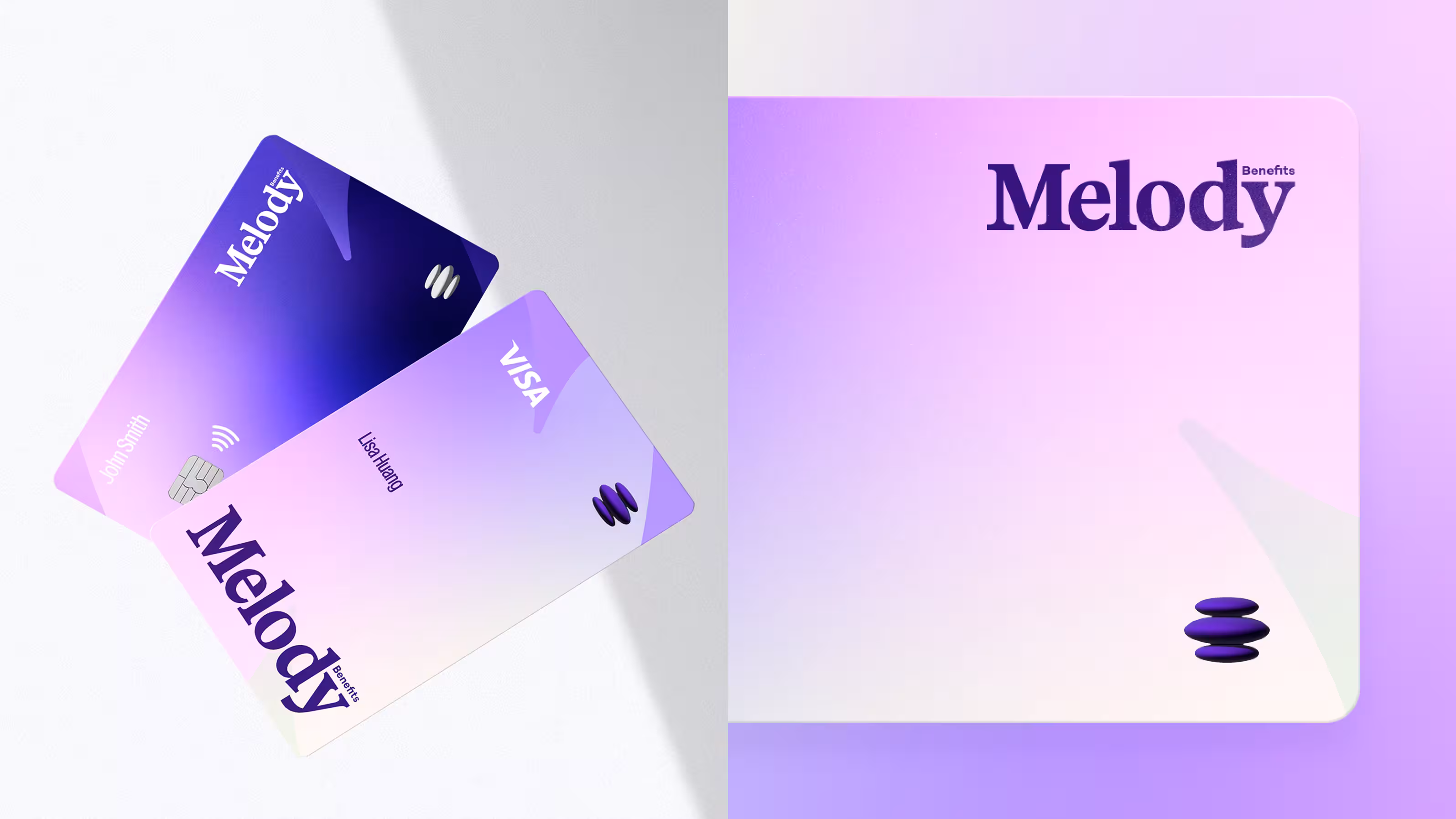


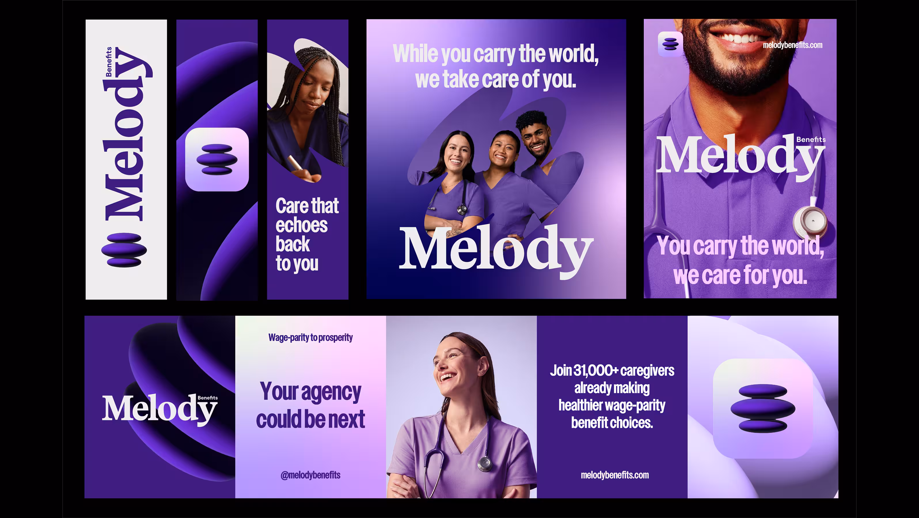
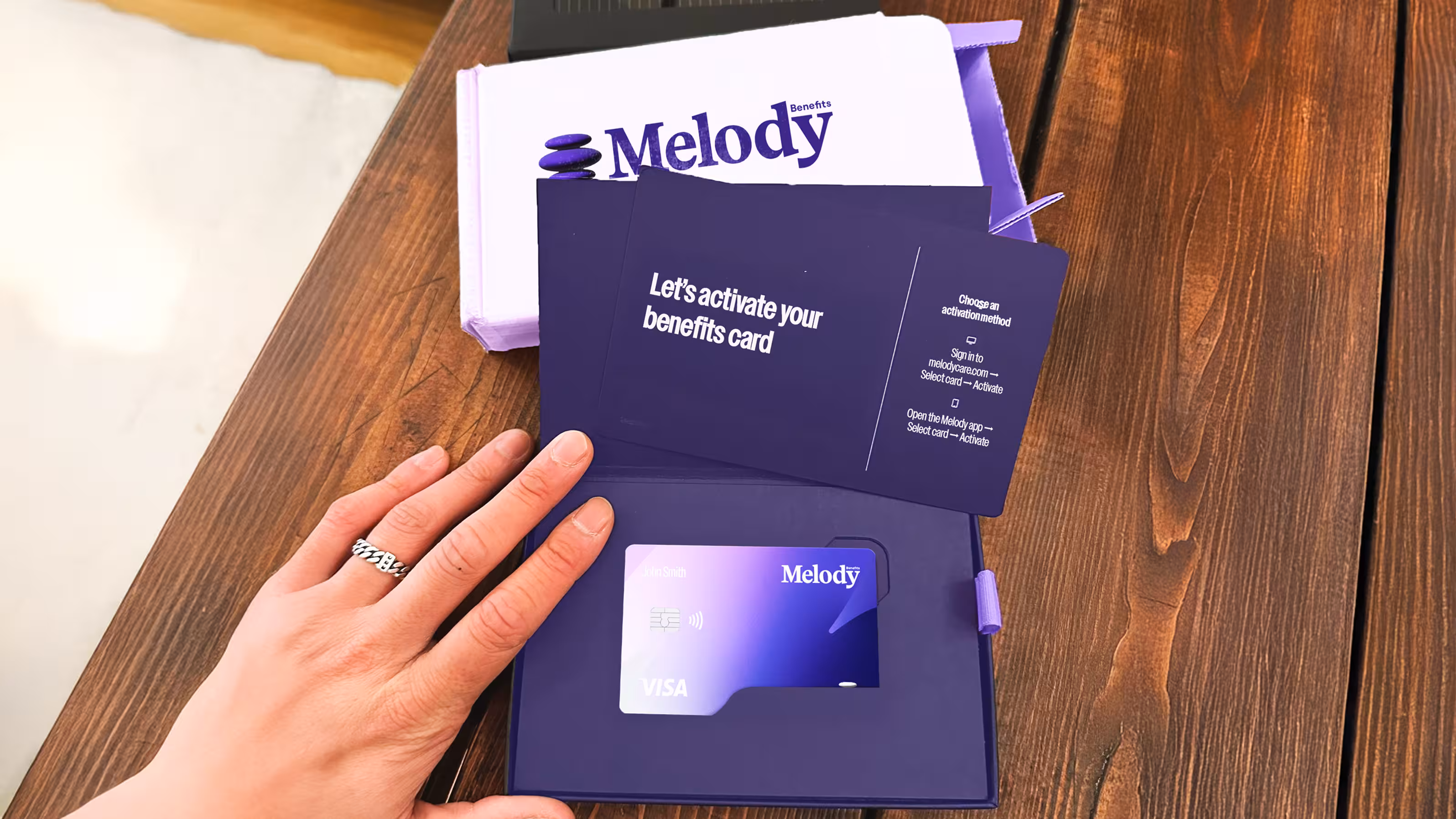

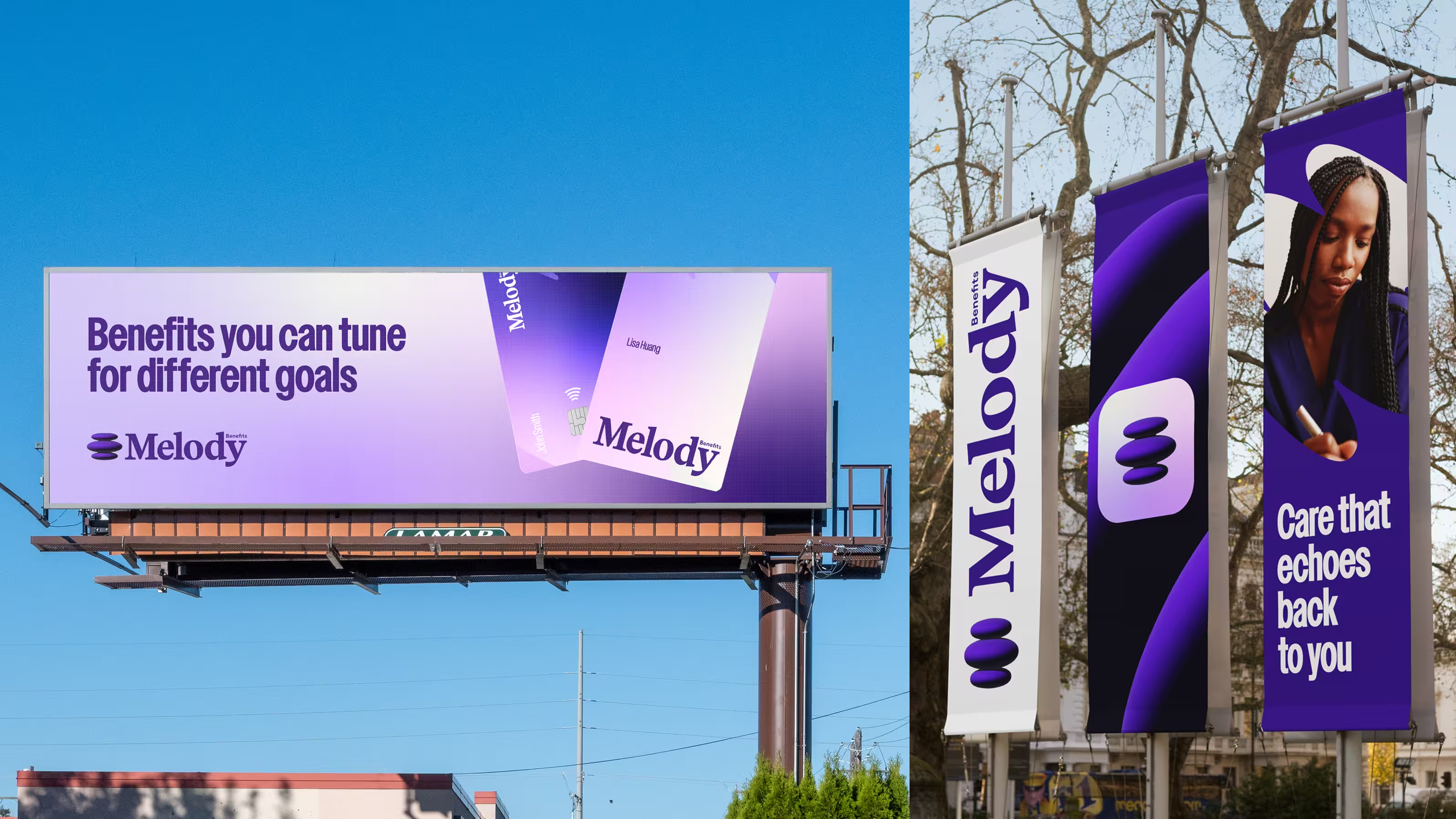
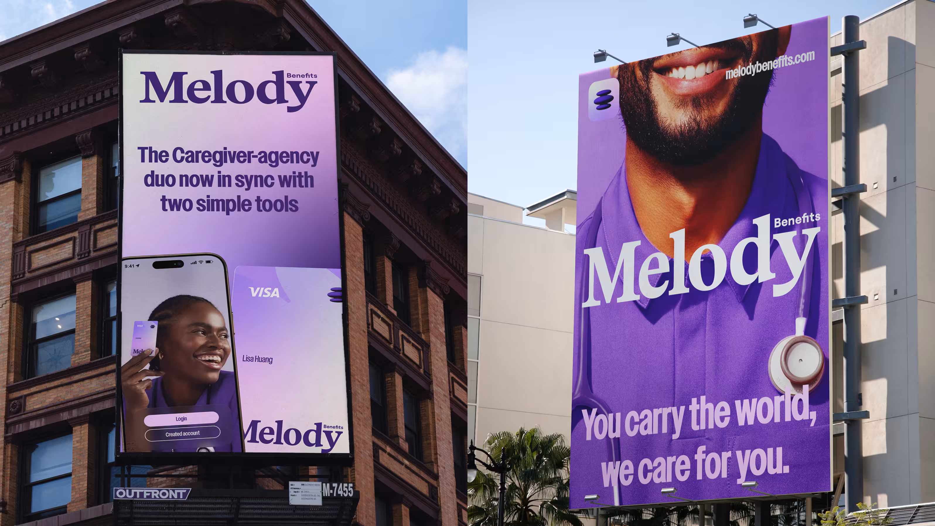
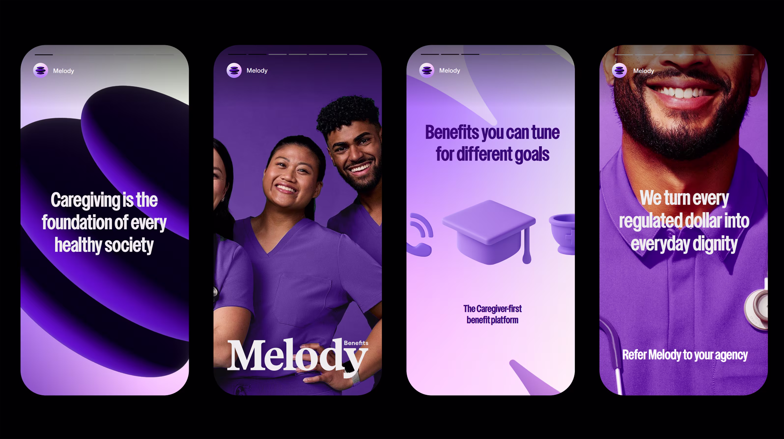
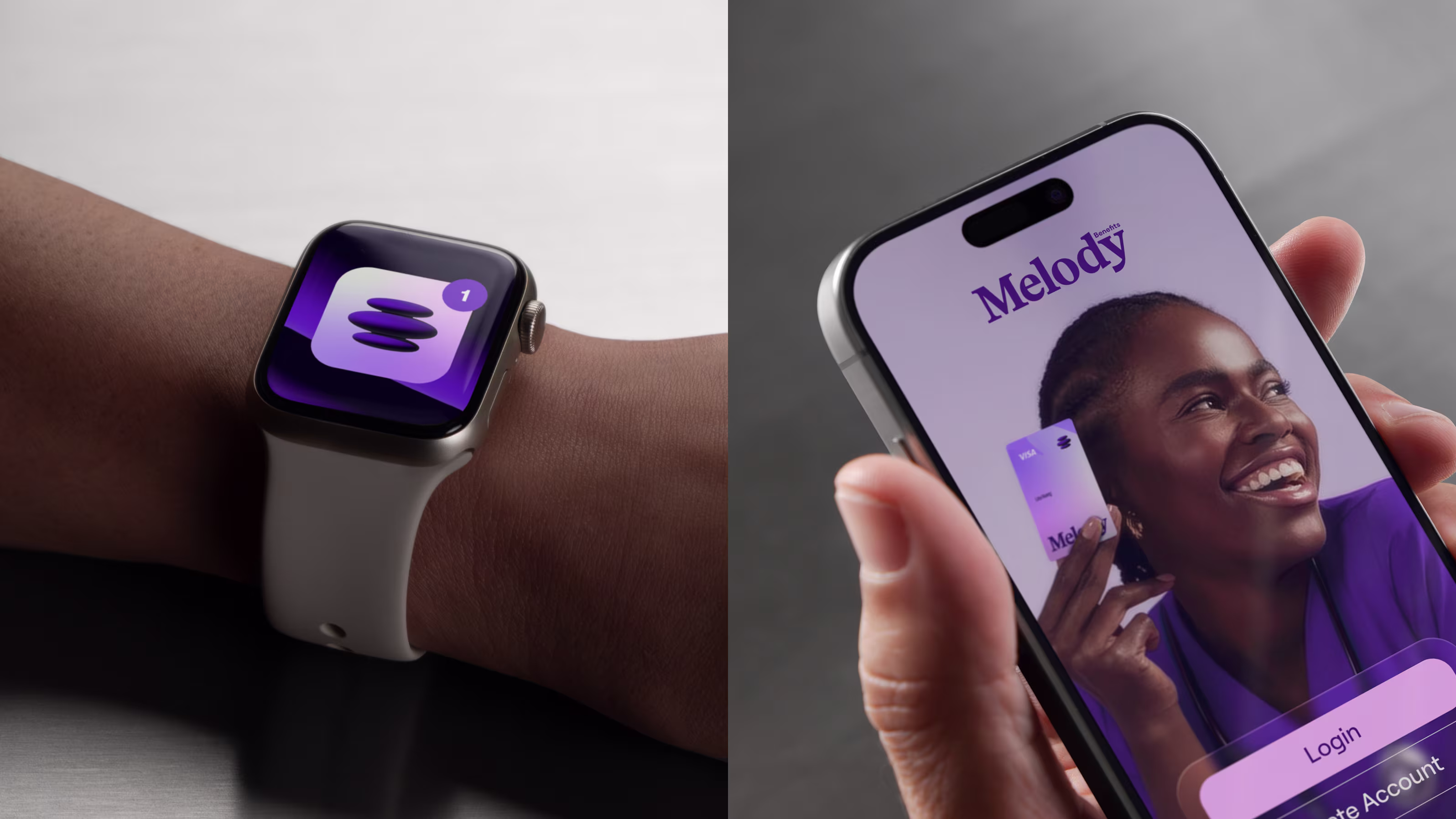
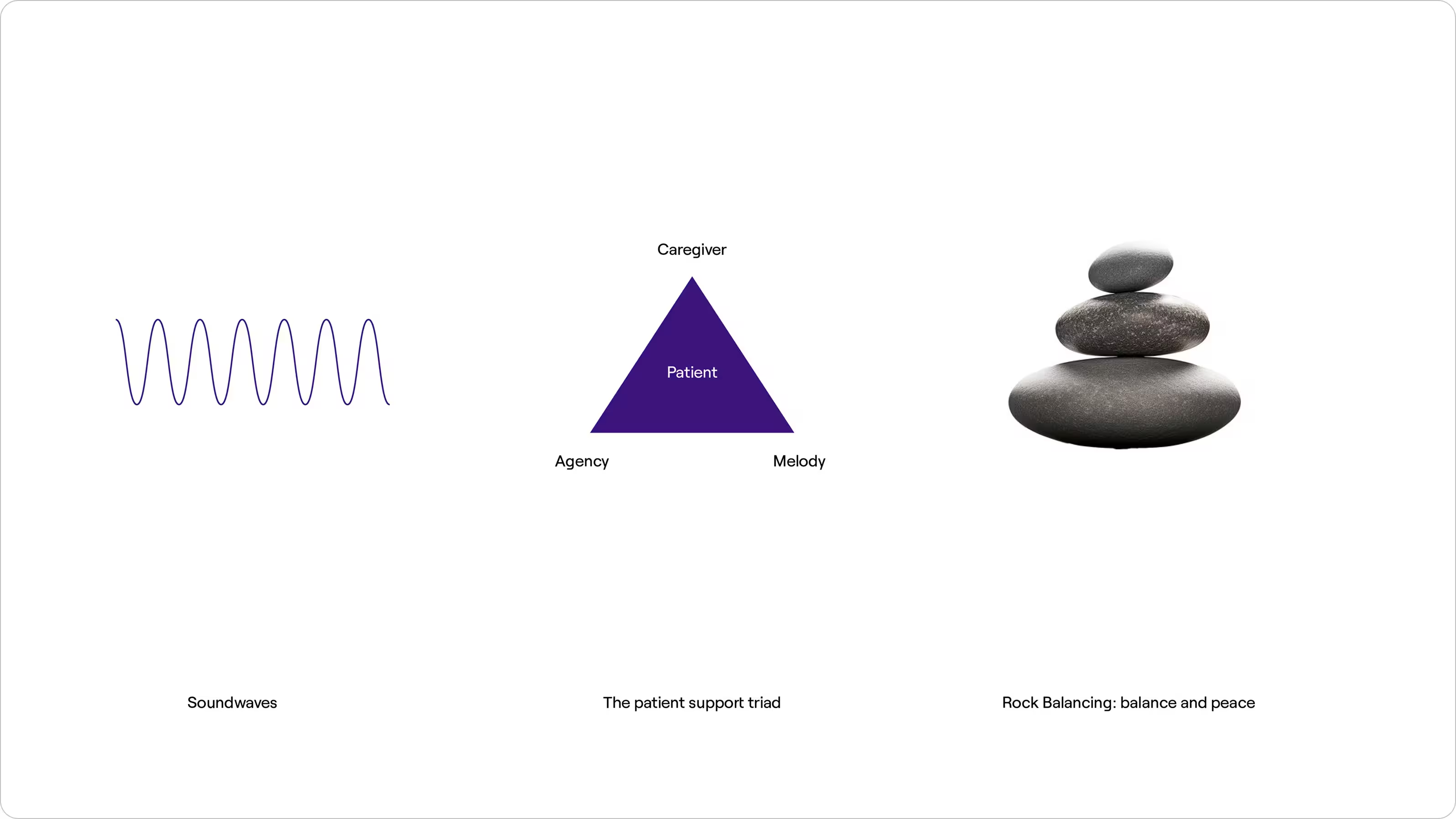
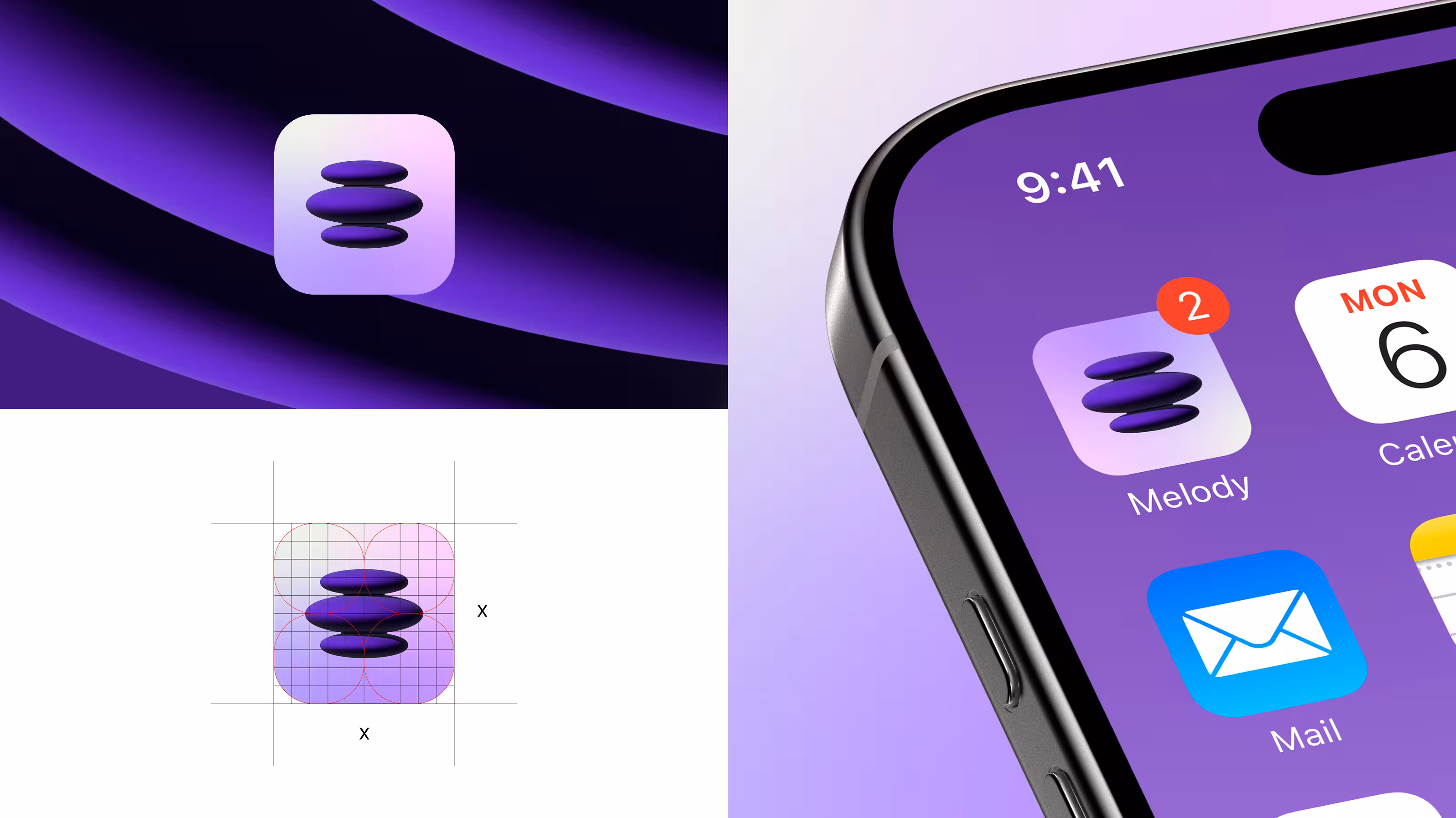
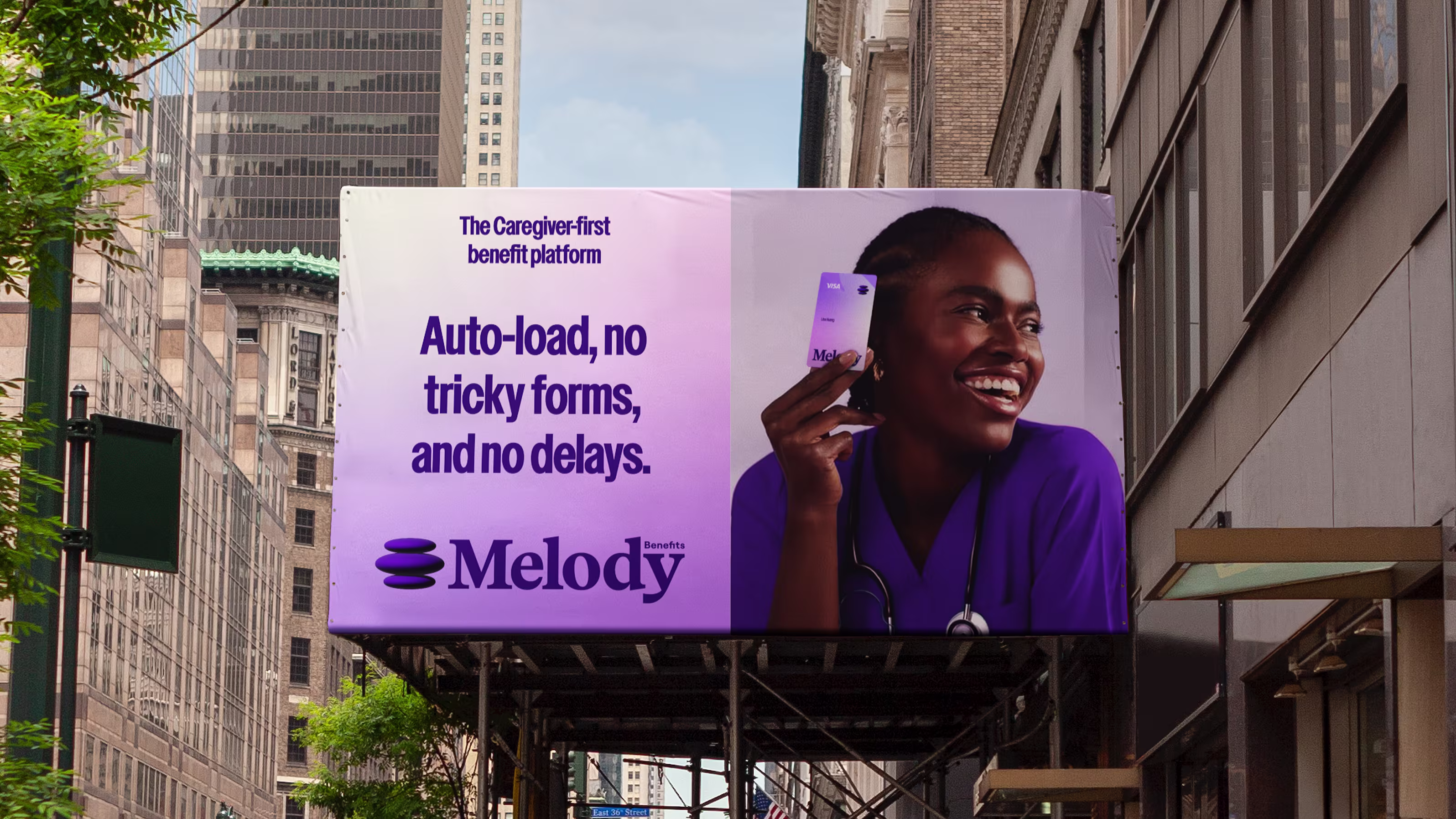
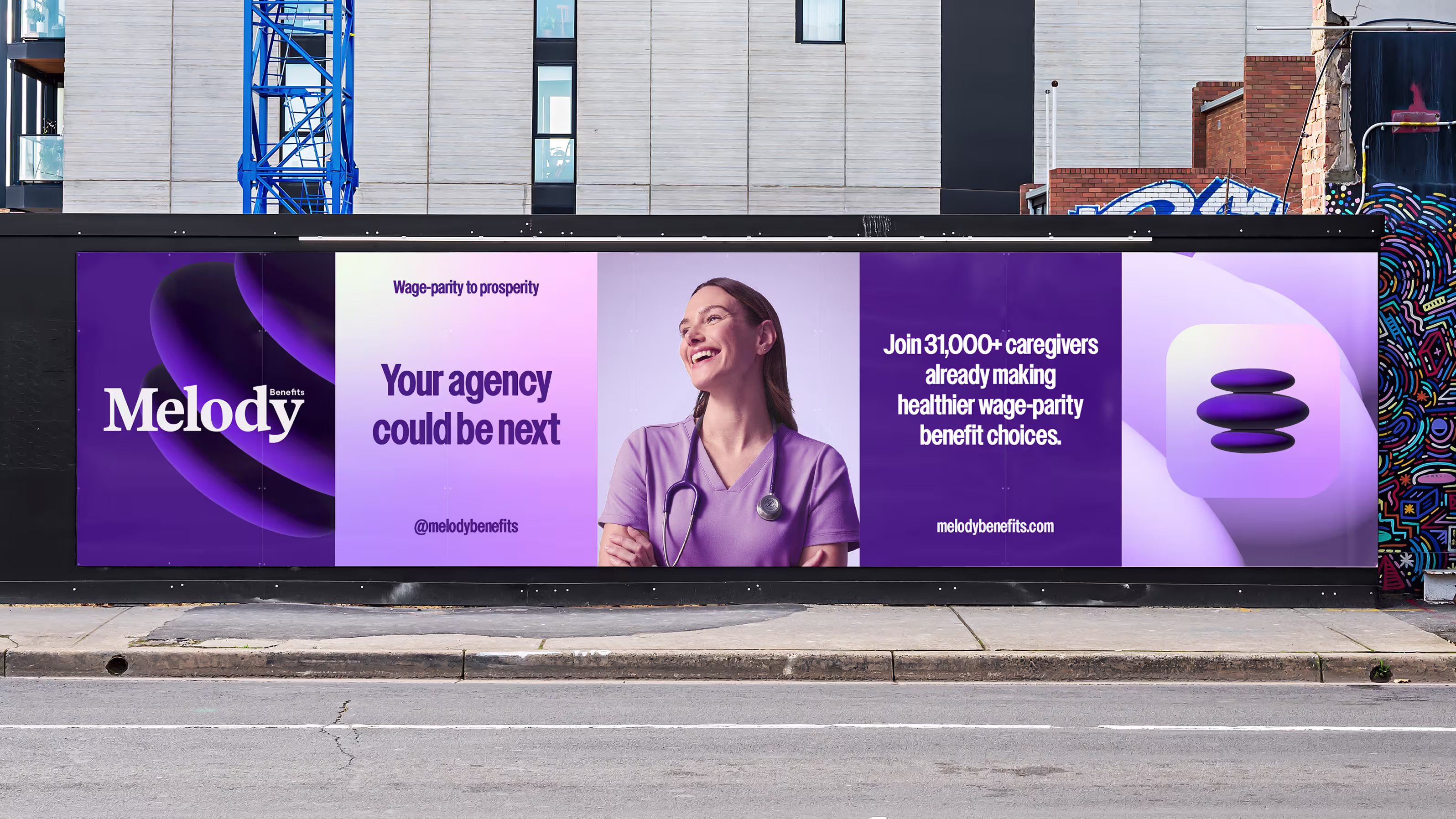
Visually, the new Melody identity carries the same emotional intelligence as its mission. Purple remained at the center, but it needed evolution. The old palette felt overly cool and distant, so we recalibrated the tones to bring warmth and humanity forward, introducing soft pinks and lavender gradients to create a system that feels restorative rather than corporate.
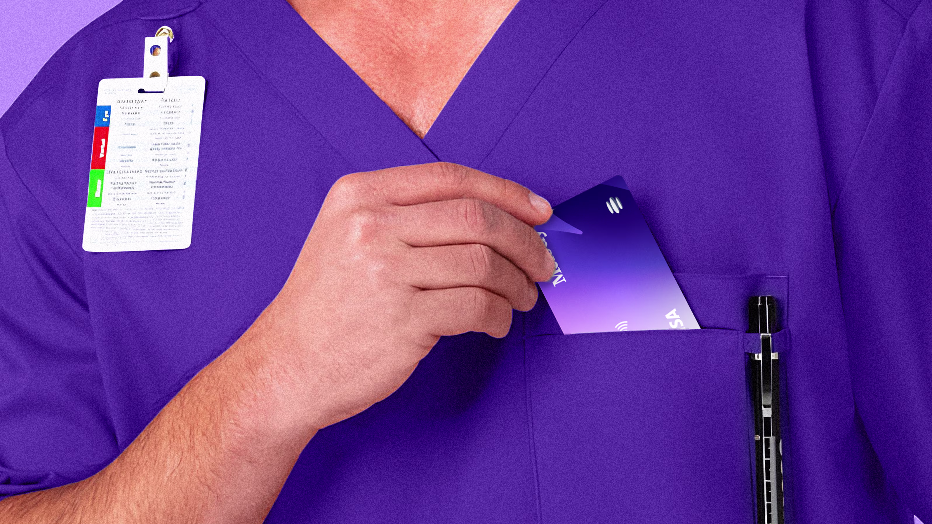
We moved from a neutral sans-serif to a confident serif wordmark to restore dignity, trust, and composure. The new serif borrows cues from institutions of credibility, like editorial brands, universities, and fashion houses, while staying modern, elegant, and grounded, the typographic equivalent of a steady hand. Melody’s symbol was also reimagined, not as sound waves, but as a literal platform. Three rounded forms stack like stones in equilibrium, representing the triad of caregiver, agency, and Melody, and forming a structure of support that feels functional, serene, and memorable. Photography shifted away from staged clinical imagery toward real connection, joyful expressions, human touch, and the quiet evidence of care, so caregivers instantly feel, “This is for me.” Collectively, these decisions rebuilt Melody into a brand that speaks clearly, feels deeply, and earns trust at first glance, balancing professionalism with compassion in a visual language where design itself performs care.

The rebrand clarified Melody’s message and realigned its company culture. Internally, the shift gave the team a renewed sense of purpose and confidence. Externally, the transformation reshaped how agencies and caregivers engage with the brand. The new brand greets caregivers with empathy rather than bureaucracy, while agencies find the efficiency they need without losing warmth. In every expression, the brand echoes its promise: care that echoes back to you.
Melody no longer hides behind the language of compliance. It leads with the language of care, a visual and verbal system that restores simplicity, trust, and dignity to those who carry the world.