Established in Brooklyn, NY in 1918, Flaum is a fifth-generation, family-run Jewish and Kosher deli brand synonymous with comfort, community, and tradition. Over a century of operation has turned its name into a fixture of New York kitchens — the kind of brand that’s passed down between generations as part of family recipes. From smoked fish and pickles to dips and salads, Flaum’s products deliver a familiar taste of heritage in a world that’s constantly modernizing.
Yet despite its loyal following, Flaum’s visual identity hadn’t kept pace with its reputation. Its packaging spoke of function rather than feeling, and while the products were beloved, the brand itself often faded into the background. On shelves crowded with color and competition, Flaum had become a quiet classic — dependable, but invisible. The brand’s next chapter called for a renewal that would honor its roots while reclaiming visibility in a fiercely competitive market.

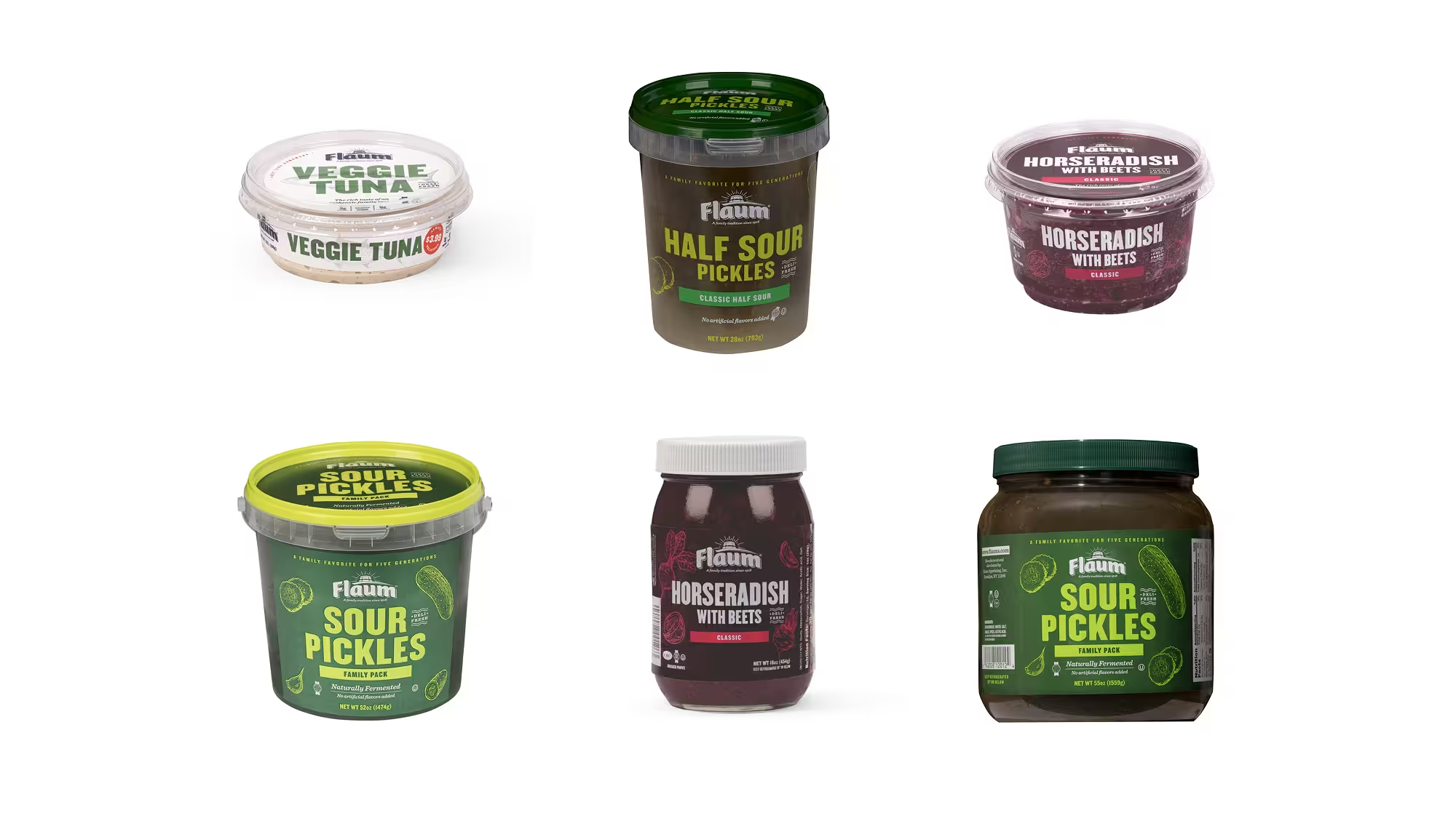

When Flaum approached M/OTG, their concern was simple yet urgent: no one could see them.The previous packaging prioritized product names nearly 200% larger than the brand logo, diluting visibility and recognition. Without a unifying system or dominant anchor, Flaum’s most important touchpoint — its packaging — lacked a sense of ownership. It was coherent, yes, but not commanding.
What Flaum needed was clarity and confidence — a brand-first approach that would reassert its legacy while signaling relevance to new generations. We recognized that the solution wasn’t just aesthetic, but strategic: Flaum needed to establish distinctive, ownable brand elements that would make it instantly recognizable, even from across the aisle. Shelf space is a battleground, and Flaum’s identity had to fight — and win — with visibility, consistency, and modern appeal.


We began by reframing the way Flaum thought about its touchpoints. Every point of interaction — from the logo on a jar to a van crossing Brooklyn — needed to reinforce the same emotion and message. For a brand steeped in heritage, packaging wasn’t just functional; it was storytelling in miniature. Through deep research and design exploration, we built a system to make Flaum’s visual language as bold and memorable as its flavors.
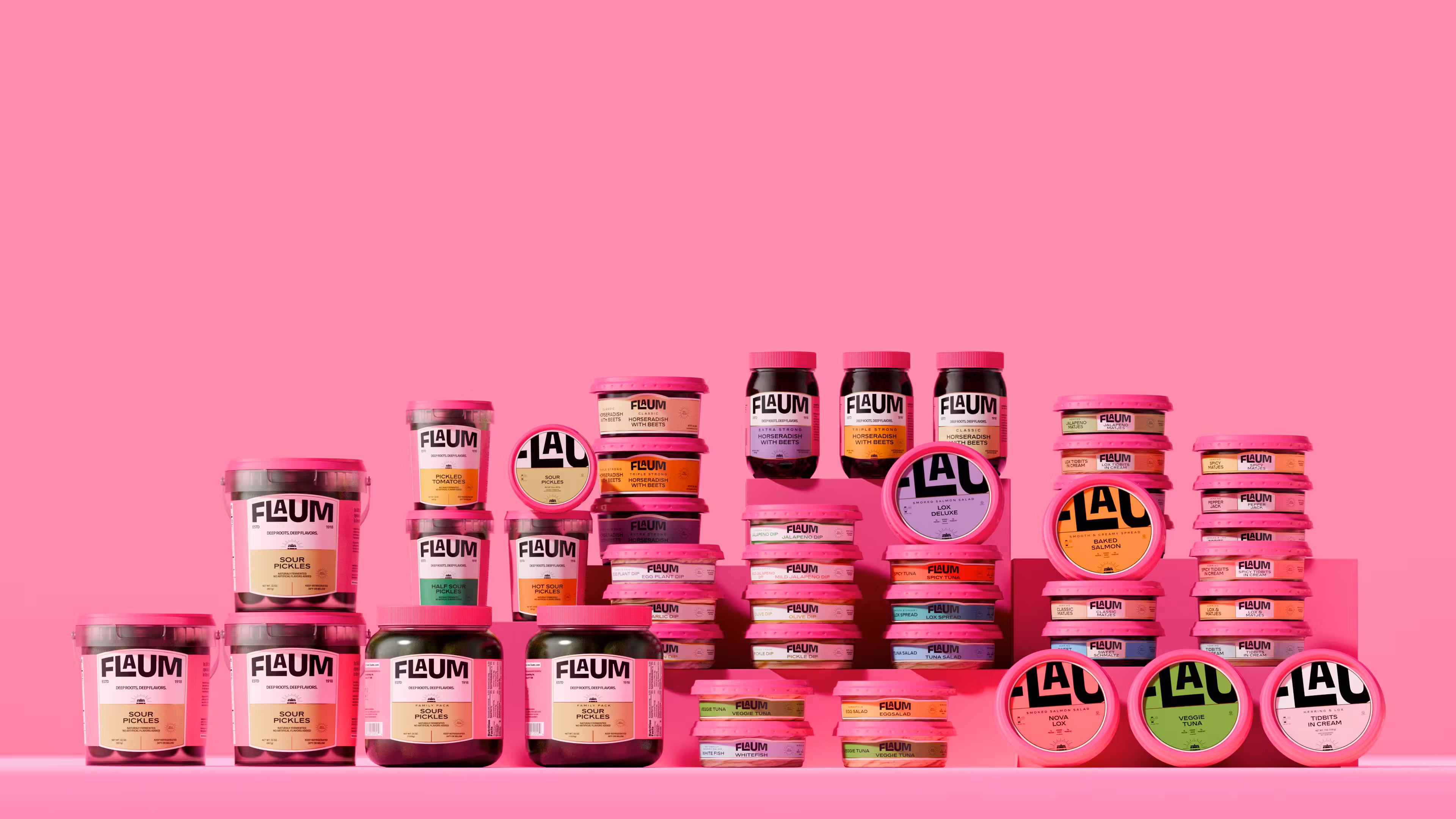
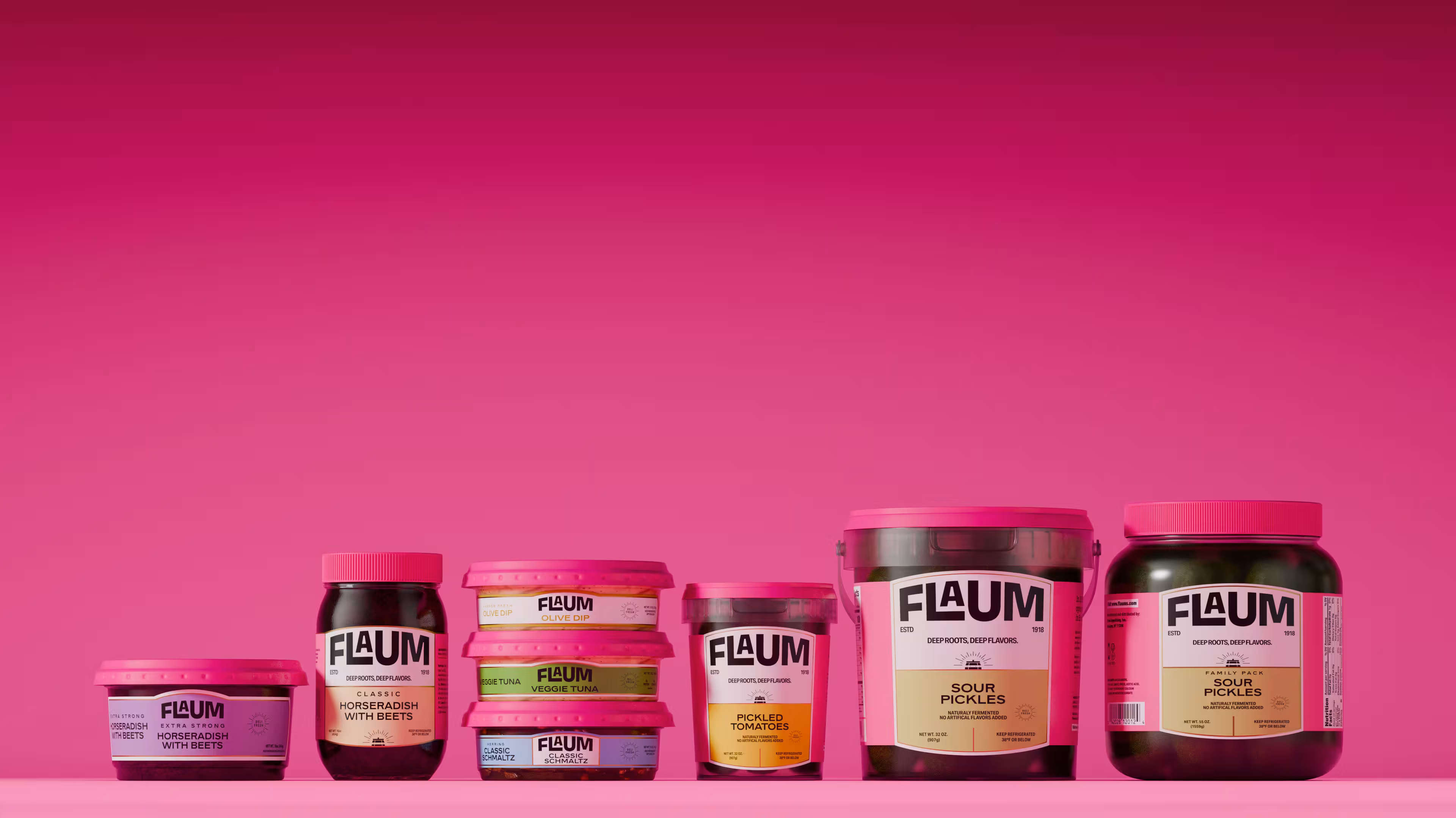
The foundation of this system rested on two essential functions of great packaging: distinction and identification. We analyzed category benchmarks — Coca-Cola’s unmistakable bottle, Kraft Heinz’s adaptive labels, Liquid Death’s rule-breaking attitude — and distilled a single guiding question: What would make Flaum unforgettable? The answer came in a striking, confident hue. Hot pink became the new anchor of the brand — a color that embodied courage, modernity, and unmistakable shelf presence. “Pink isn’t just a color,” we realized. “It’s courage. It’s confidence. It’s audacity.”


The redesigned Flaum identity introduced a stronger, more memorable wordmark — a no-nonsense, black-and-white logotype set over the brand’s signature arc. This arched form, drawn from Flaum’s visual history, was refined and amplified, reconnecting the brand to its roots while giving it the authority of an icon. The custom typography solution cleverly tucks the ‘A’ into the ‘L’ and ‘U’, maintaining tight geometry and visual flow across applications.
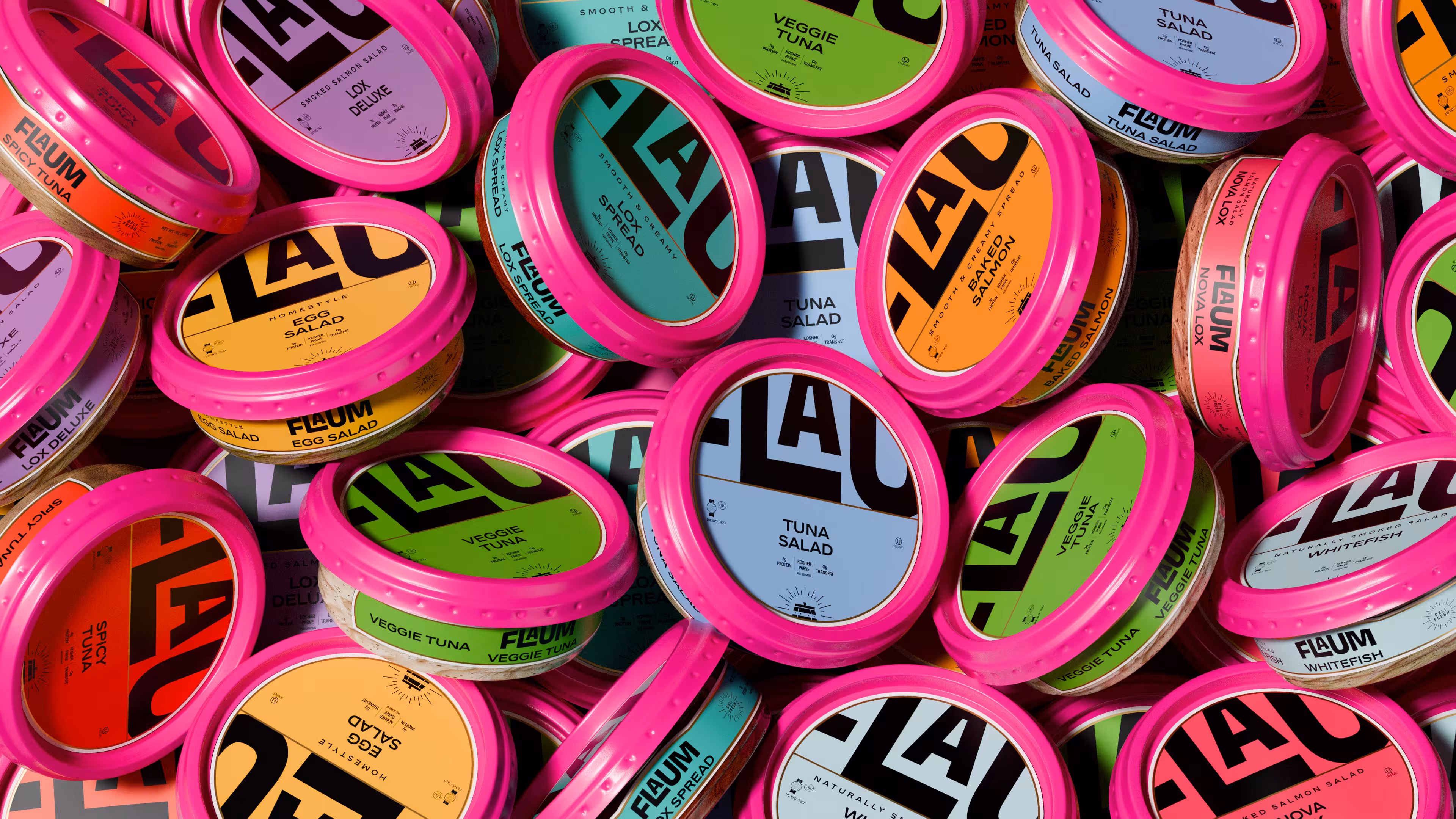
Supporting typefaces, Gooper and Rework Headline, established a distinctive typographic hierarchy — balancing the approachable with the precise. Gooper’s semi-condensed, rounded serifs added warmth to messaging, while Rework Headline provided clarity and function across labels. The hot pink hue unified all 45 packaging variations across six product categories, transforming the entire range into a coherent, instantly recognizable system. Each product became a miniature billboard — a vivid, confident declaration of who Flaum is and where it’s going.


The results were immediate and visible — literally. Flaum’s new packaging broke through the visual noise of the deli aisle, reclaiming space and attention. Retail partners began granting the brand more real estate on shelves, recognizing the new system’s striking visual consistency. Shoppers, drawn in by the bold pink and confident branding, rediscovered a name they’d long trusted but rarely noticed.
Beyond the shelves, the transformation reinvigorated the brand internally and externally. The new identity gave Flaum the visual tools to own its legacy while speaking to a new audience — one that values authenticity but expects modernity. What was once a nostalgic classic now stands proudly as a revived icon: timeless in spirit, unapologetically bold in expression. In the concrete jungle of New York, Flaum’s pink van — and pink identity — are impossible to miss.